Analyzing Tabular Data
Last updated on 2025-11-18 | Edit this page
Overview
Questions
- What quantitative analysis operations can be performed on tabular data?
- How can these operations be translated into Python code?
Objectives
- Learn how to initiate the analysis of tabular data
- Understand which aspects of a tabular dataset can be analyzed quantitatively
- Learn to break down the analysis into smaller tasks, think in terms of computer logic by writing pseudocode, and translate these tasks into code
- Learn using the Python library Pandas for analyzing tabular data
- Learn using the Python library Plotly for visualizing tabular data
Let’s take on the role of an art historian in this chapter and analyze the MoMA dataset introduced in the Summary and Setup section. We’ll assume that we are completely unfamiliar with the dataset, its contents, structure, or potential usefulness for our research. The first step would be to look at this dataset and get familiar with its shape, dimension and different aspects. This initial stage of investigation is known as exploratory data analysis.
To begin, we first need to open an IDE (Integrated Development Environment), select the programming language we’ll use, and load the dataset into the environment to start working with it. In this case, we’ll be using Jupyter Notebook as our IDE and Python as our programming language.
Step 1 - Importing the Necessary Python Libraries
Modern computers operate using only ones and zeros — binary code. These binary digits can be combined to represent letters, numbers, images, and all other forms of data. At the most fundamental level, this is the only type of information a computer can process.
However, when you’re writing code to analyze data or build applications, you don’t want to start from scratch — managing raw binary data or even working solely with basic characters and numbers. That would be extremely time-consuming and complex. Fortunately, others have already done much of this foundational work for us. Over the years, developers have created collections of pre-written code that simplify programming. You can think of these collections as toolboxes containing functions and methods that perform complex tasks with just a line or two of code. In Python, these toolboxes are called libraries.
A function is a reusable block of code that performs a specific task. You write it once and can use it multiple times. Think of it like a kitchen recipe: you follow the same steps every time you want to bake a cake. Functions help make your code cleaner, shorter, and easier to manage.
A method is just like a function, but it “belongs” to something — usually an object like a string, list, or number. You use methods to perform actions on those objects.
An argument is a value you give to a function or method so it can do its job using that value.
When you define a function, you can set it up to accept input values.
These inputs are called parameters. When you actually
call the function and give it real values, those are called arguments.
For example, in the following code, I am defining a function called
greet. The function takes the name of a person and says
hello to that person. Here, name is a parameter, whereas
Basma is an argument:
Some Python libraries come built into the language, while others must
be installed separately. Most external libraries can be easily installed
via the terminal using a
tool called pip.
Many Python libraries have quirky or creative names — part of the fun
and culture of the programming world! For example, there’s a library
called BeautifulSoup for working with web data, and another
called pandas for data analysis. Sometimes the name hints
at the library’s purpose, and sometimes it doesn’t — but you’ll get used
to them over time. As you gain experience, you’ll learn what each
library is for, the tools it provides, and when to use them.
To use a library in your code, you first need to ensure it is
installed on your computer. Then, you must import it into your script.
If the library’s name is long or cumbersome, you can assign it a shorter
alias when importing it. For instance, in the example below, the
pandas library is imported and abbreviated as
pd. While you’re free to choose any abbreviation, many
libraries have common conventions that help make your code more readable
to other programmers. In the case of pandas,
pd is the widely recognized standard.
Step 2 - Loading the Data into Your Code
Understand the data type
The MoMA dataset we will be working with is stored in a
.csv file. Go ahead and download it from the link provided
in the Summary and Setup section.
CSV stands for “comma-separated values”. When you double-click to open the file, the name makes perfect sense: it contains information arranged in rows, with each value in a row separated by a comma. Essentially, it’s a way to represent a table using a simple text file.
Each line in a CSV file corresponds to a row in the table, and each comma-separated value on that line represents a cell in the row. The first line often contains headers — the names of the columns — which describe what kind of data is stored in each column. For instance, a CSV file containing student information might include headers like “Name”, “Age”, “Grade”, and “Email”.
Because CSV files are plain text, they’re easy to create and read using basic tools like text editors or spreadsheet programs. They’re also widely supported by programming languages and data analysis tools, making them a popular and convenient format for storing and exchanging tabular data.
The data you want to analyze is typically stored either locally on your computer or hosted online. Regardless of where it’s located, the first step in working with it is to load it into your code so you can analyze or manipulate it.
Store the data in a variable
When you load data into your code, you should store it in a
variable. A variable functions like a container that can
contain any type of data that you think of. For example, I can create a
variable called a_number and store a number in it, like
this:
I can also store a string (a sequence of characters, including
letters, numbers, and other symbols) in a variable, which I’ll call
a_string, like this:”
PYTHON
a_string= "This is a string, consisting of numbers (like 13), letters and other signs!"
a_string
Notice that you should put the value of the string inside double or single quotes, but you shouldn’t do it for numbers.
When naming a variable, note that:
- Only letters (a-z, A-Z), digits (0-9), and underscores (_) are allowed.
- The name cannot start with a digit.
- No spaces or special characters (like !, @, #, etc.) are allowed.
- Variable names are case-sensitive. For example,
myvarandMyVarare two different variables. - You cannot use Python reserved keywords like:
if,else,for,class,return, etc. as variable names.
You can either assign a value to a variable directly in your code, as you just did, or you can load data that already exists on your computer or online, and store it in the variable. This is what we are going to do right now:
PYTHON
data_path= 'https://raw.githubusercontent.com/HERMES-DKZ/Python_101_humanities/main/episodes/data/moma_artworks.csv'You already know that CSV files actually represent tabular data. To
make our .csv file look like a table and become more
readable and easier to work with, we are going to load it into a
DataFrame.
DataFrames are powerful table-like data structures that can be
created and manipulated using the pandas library, which we
have previously imported into our code. A DataFrame organizes data into
rows and columns, similar to a spreadsheet or database table. Each
column in a DataFrame has a name (often taken from the header row of the
CSV file), and each row represents an individual record or
observation.
DataFrames are especially useful because they allow us to apply powerful functions and methods that simplify working with structured data. Whether you’re analyzing trends, generating summaries, or preparing data for visualization, DataFrames provide a convenient and flexible way to manage your data.
In the following code snippet, we use the read_csv()
function from pandas to load the contents of the CSV file
into a DataFrame. This function reads the file and automatically turns
it into a DataFrame. In this example, I am passing only one argument to
the read_csv() function: the address of the
.csv file that I want to load. I have already saved this
address in the variable data_path. moma_df is
the variable where we store the resulting DataFrame. Once the data is in
a DataFrame, we can easily explore it, filter rows, select specific
columns, clean the data, and perform many types of analysis.
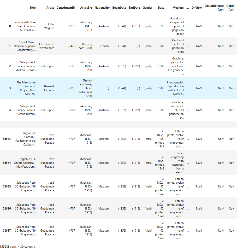
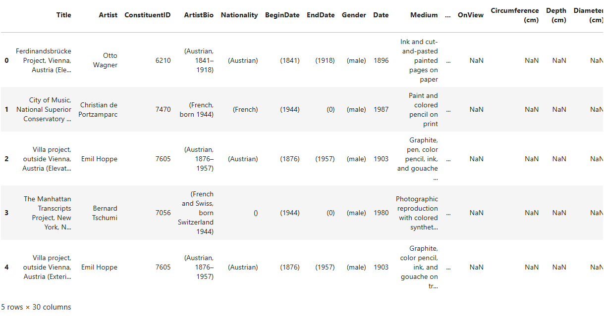
As you can see, this is a large DataFrame, containing 158,688 rows
and 30 columns. For now, we’re only interested in viewing the first few
rows to get a quick overview of its structure — specifically the column
names and the types of values stored in each column. To do this, we’ll
use the DataFrame’s .head() method, like so:
.head() is a method, which means it’s a type of function
that’s associated with a specific object — in this case, a DataFrame.
Like regular functions, methods can accept arguments placed within the
parentheses that follow them. If you don’t provide one,
.head() will return the first five rows by default. If you
pass a number (e.g., moma_df.head(2)), it will return that
many rows from the top of the DataFrame.
Writing pseudocode
By now, you can see that writing code follows a clear and logical workflow. As a beginner, it’s good practice to start by writing pseudocode — a rough outline of your steps in plain, natural language — before translating it into actual code. This helps you plan your approach and stay focused on the logic behind each step.
For example, the steps we’ve taken so far might look like this in pseudocode:
- Import the necessary libraries.
- Save the file path where the data is stored in a variable.
- Load the data into the program from that path.
- Convert the data into a table format that’s easier to explore.
- Display only the first few rows of the table to avoid overwhelming output.
This pseudocode translates into the following Python code, which brings together all the lines we’ve written so far:
This dataset contains several aspects that can contribute to research in art history. We will perform three distinct processes — counting, searching, and visualizing — which, as mentioned earlier, could potentially aid in quantitative humanities research. After completing each step, we will analyze the results and discuss whether they provide meaningful insights for scientific research or if they lack scientific significance.
Step 3 - Counting and Searching
You can count all or a selected group of data points in a DataFrame.
To start, let’s get an overview of the counts and data types present in
the DataFrame. To do this, we’ll use the .info() method on
the DataFrame:
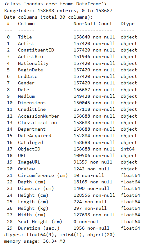
This method provides valuable information about the DataFrame in a tabular format.
Insights from the .info()
Method
In the first column of the resulting table, you can see the names and numbers of all the columns in the DataFrame. As shown here, the first column, “Title”, is numbered as “0”. REMEMBER: In Python, indexing and counting always start from zero. This concept is important to keep in mind when working with lists, strings, Series, DataFrames, dictionaries, and other data structures.
The second column in the table displays the number of “non-null” (non-empty) values in each DataFrame column. If you refer back to the first five rows of the DataFrame, you’ll notice that “NaN” appears quite frequently. “NaN” stands for “Not a Number” and is a special value used to represent missing, undefined, or unrepresentable numerical data.
When preparing datasets, like the one from MoMA, it’s crucial for people working at GLAM (Galleries, Libraries, Archives, Museums) institutions not to leave any cells empty. If left blank, users may mistakenly believe that the value was simply forgotten. By using “NaN”, the data preparers are indicating that they have no information about a particular data point. For example, when “NaN” appears under the “Circumference” column of an artwork, it means there is no available measurement for the artwork’s circumference.
Some providers of DataSets use other values instead of “NaN” to imply a missing value, such as:
| Situation | Missing Value |
|---|---|
| Numeric data | NaN or None |
| Text data | None or “Unknown” |
| Database tables | NULL |
| External systems (e.g. Excel) | “N/A”, #N/A, blank |
Returning to the DataFrame info, “non-null” values refer to values that are not NaN, NULL, N/A, or their equivalents. In other words, these are the useful values that contain meaningful information.
-
The third column in the info table shows the data type of the values in each column. A data type tells Python (or, in this case, pandas) what kind of value something is, so it knows how to handle it. In this dataset, we have three main data types: “object”, “int64”, and “float64”.
- “int” stands for integer — whole numbers without decimals (e.g., 1, 2, 3, …). The “64” in “int64” refers to the number of bits used to store the integer in memory: 64 bits. Larger sizes allow for the storage of larger numbers more accurately.
- “float” stands for floating-point numbers (or decimal numbers), such as 1.345, 12.34878, or -0.1. Similarly, “64” in “float64” indicates the size of the number in memory, using 64 bits to store each decimal.
-
Finally, in
pandas, anything that isn’t clearly a number is categorized as an “object”. Examples of objects in pandas include:- Strings (text): “apple”, “John”, “abc123”
- Lists with mixed values: [“hello”, 3, None]
- Python objects
The .info() method has already provided us with valuable
insights into the data types in moma_df and how they should
be handled during analysis. It has also performed some counting for us.
Now, we can begin counting more specific elements within this DataFrame.
For example, we can identify all the artist names in the DataFrame and
determine how many works by each artist are included in MoMA’s
collection.
Challenge
How do you think we should proceed? Can you break down this task into single steps and write the pseudocode for each step?
We need to create a new DataFrame based on moma_df
regarding the task at hand. This new DataFrame should contain two
columns: the artist names and number of times each name appears in
moma_df.
The pseudocode for this task looks something like this:
- Look at the column "Artist" in moma_df and find individual artist names.
- Count the number of times each individual artist name appears in moma_df.
- Store the artist names and the number of their mentions in a new DataFrame called artist_counts.
Let’s translate the pseudocode into Python code:
PYTHON
artist_counts = moma_df['Artist'].value_counts().reset_index()
artist_counts.columns = ['Artist', 'Number of Works']
artist_counts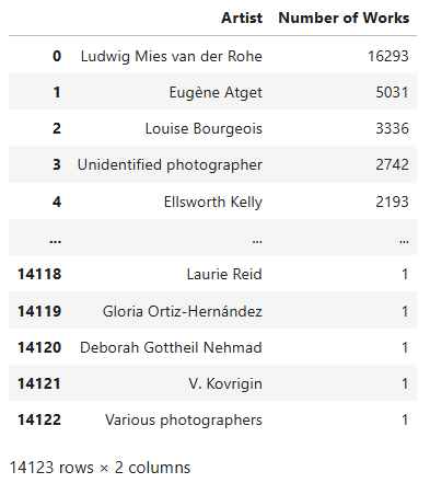
Let’s analyze the code line by line
artist_counts = moma_df['Artist'].value_counts().reset_index()When you use the .value_counts() method in
pandas, it returns a Series where:
- The index consists of the unique values from the original column in
moma_df(in this case, from the “Artist” column). - The values represent how many times each artist appears in that column.
While this format is informative, it’s not as flexible for further
analysis because it’s not a DataFrame with named columns. By adding
.reset_index(), you’re instructing pandas to convert the
index (artist names) into a regular column. Afterwards, we rename the
columns like this:
artist_counts.columns = ['Artist', 'Number of Works']Here, we’re assigning a list of two strings to rename the columns appropriately.
Now that we’ve created the artist_counts DataFrame, we
can perform statistical operations on it. While such statistical
insights may not be significant for scholarly research in art history —
since MoMA’s collection does not comprehensively represent global or
regional art histories — they do shed light on the scope and patterns of
MoMA’s collection practices.
To deepen our statistical analysis, it would be helpful to have
additional information about the artists — such as their nationality and
gender. Let’s create a new DataFrame that includes these details and
name it artist_info.
Challenge
Can you break down this task into single steps and write the pseudocode for each step?
In the new DataFrame, we need more information than just “Artist” and “Number of Works”. We also need “Gender” and “Nationality” for this task.
Here’s the pseudocode for solving this challenge:
- Extract a new DataFrame from
moma_dfthat includes only the artist names, their gender, and nationality. - Create another DataFrame from
moma_dfthat includes artist names along with the count of how many times each artist appears. - Merge these two DataFrames into a third DataFrame that combines the artist information with their work counts.
Again, let’s translate the pseudocode to Python code:
PYTHON
artist_details = moma_df.groupby('Artist')[['Gender', 'Nationality']].first().reset_index()
artist_counts = moma_df['Artist'].value_counts().reset_index()
artist_counts.columns = ['Artist', 'Number of Works']
artist_info = artist_counts.merge(artist_details, on='Artist', how='left')
artist_info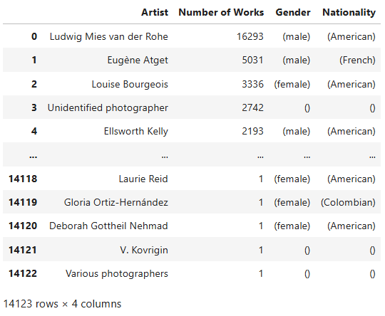
Let’s analyze the code line by line
artist_details = moma_df.groupby('Artist')[['Gender', 'Nationality']].first().reset_index()-
moma_df.groupby('Artist')groups the DataFrame by the ‘Artist’ column. Each group contains all rows associated with a single artist. -
[['Gender', 'Nationality']]selects only the ‘Gender’ and ‘Nationality’ columns from these groups, as we’re interested in these attributes. -
.first()extracts the first non-null row from each group. This is useful when an artist appears multiple times with inconsistent or missing gender/nationality data — we simply take the first available record. -
.reset_index()converts the grouped index (‘Artist’) back into a standard column, so it becomes part of the DataFrame again. - The result is saved in a new DataFrame called
artist_details, which contains one row per artist along with their gender and nationality.
artist_counts = moma_df['Artist'].value_counts().reset_index()
artist_counts.columns = ['Artist', 'Number of Works']- This code creates another DataFrame,
artist_counts, containing the number of works associated with each artist inmoma_df. - This is the same step as we took in the previous task. We use the
method
.value_counts()to count how many times each artist appears, and then use.reset_index()to turn the artist names back into a column. - The columns are renamed to ‘Artist’ and ‘Number of Works’.
artist_info = artist_counts.merge(artist_details, on='Artist', how='left')- Now we merge the two DataFrames,
artist_countsandartist_details, into one comprehensive DataFrame calledartist_info. - The
on='Artist'argument tellspandasto merge the data based on matching values in the ‘Artist’ column. -
how='left'specifies a left join: all artists fromartist_countsare kept, and any matching rows fromartist_detailsare added. If no match is found, the missing fields will be filled withNaN.
Note:
When you’re faced with complex, multi-line code and find it difficult to understand what each line - or even each function or method within a line - is doing, try the following strategy:
- Add a new cell to your Jupyter Notebook.
- Identify the specific part of the code you want to understand
better, and assign it to a variable of your choice. For example, suppose
you want to examine the DataFrame
artist_countsbefore the.reset_index()method is applied. You can assign everything before.reset_index()to a new variable — let’s call ittest_index— and then display its contents:
- Now you can compare
test_indexwithartist_counts. The differences between them will show you exactly what the.reset_index()method does.
With the artist_info DataFrame ready, we can start
exploring the composition of MoMA’s collection. Let’s begin by examining
how many works are attributed to artists of different genders. This will
give us a basic understanding of gender representation in the museum’s
holdings.
Challenge
Write the Python code that shows how many works in MoMA’s collection are attributed to artists of different genders.
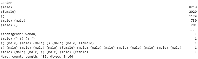
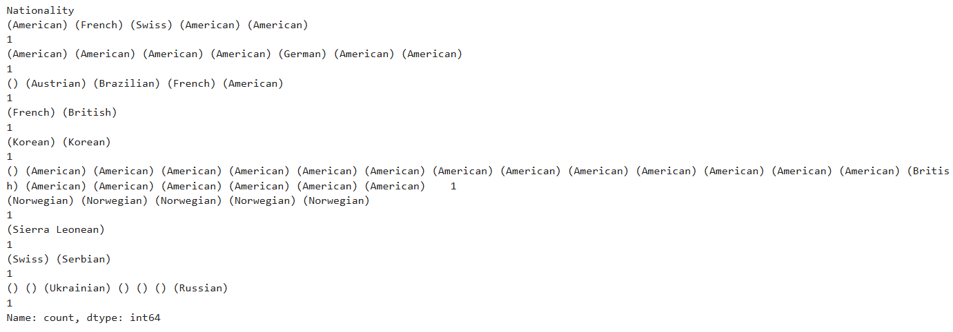
It appears that MoMA holds four times as many works by male artists as by female artists, highlighting a significant gender imbalance. However, other gender-related factors should also be considered. For instance, the gender of 1,129 artists remains unspecified — possibly because the artists are unknown or the work was created by a collective.
Additionally, there are entries with gender labels such as “() (male)
(male) (male) () (male) (male) (female)”, which likely indicate that the
artwork was produced by a group of individuals with the listed genders.
To clarify this, let’s examine the moma_df dataset to
identify the artist and corresponding artwork associated with this
particular gender entry.
Challenge
Write the pseudocode to find the artist and the artwork that correspond to the gender “() (male) (male) (male) () (male) (male) (female)”.
- Define the specific gender pattern as a string.
- Filter the dataset to find all rows where the ‘Gender’ column exactly matches this pattern.
- Store the filtered rows in a new DataFrame.
Let’s translate the pseudocode into Python code:
PYTHON
gender= "() (male) (male) (male) () (male) (male) (female)"
matching_artworks = moma_df[moma_df['Gender'] == gender]
matching_artworks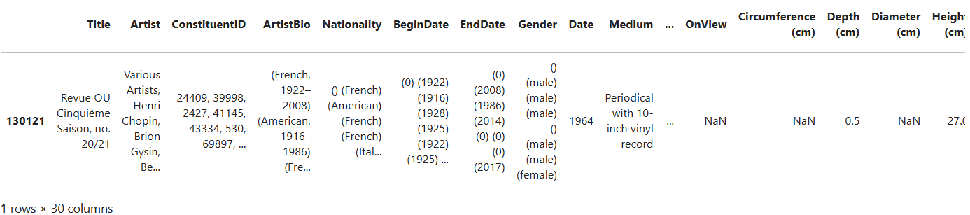
Let’s analyze the code
matching_artworks = moma_df[moma_df['Gender'] == gender]
filters the moma_df DataFrame to include only the rows
where the Gender column exactly matches the gender string defined
earlier. moma_df['Gender'] selects the Gender column from
the DataFrame, and == gender checks whether the value in
that column is exactly equal to the specified gender string.
As you can see, the artists’ name is not completely readable in the table. Let’s try to access the complete artist name for this specific artwork by adding some more pseudocode and Python code. The pseudocode for this step would look like this:
- Access the first row of the matching results.
- Retrieve the artist’s name from this row.
which translates into one line of Python code:

Let’s analyze the code
Having filtered the data to include only the rows with the specified
gender, we want to work with the first one that meets the condition.
.iloc[0] in matching_artworks.iloc[0] allows
us to do this. It accesses the first row in the
matching_artworks DataFrame. .iloc[] is used
for index-based access in a DataFrame, meaning it retrieves rows based
on their position (in this case, 0 refers to the first row).
After accessing the first row using .iloc[0],
matching_artworks.iloc[0]['Artist'] selects the ‘Artist’
column from that row. This line extracts the artist’s name from the
first row that matches the gender pattern, identifying the artist who
created the artwork with the specified gender description.
Challenge
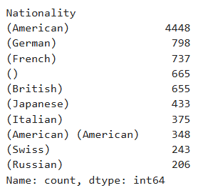
Now Let’s examine which artist nationalities are most represented in
artist_info. Write a Python code that outputs the top 10
artist nationalities from the dataset.
Challenge
Now write a code that outputs the ten least represented artist
nationalities in artist_info.
Discussion
Discuss the results with your peers in a group:
- Reflect on the insights you’ve gained through your analysis of gender, nationality, and other metadata of artworks in MoMA’s collection.
- Consider how the processes of searching and counting contributed to these insights.
- How would you interpret the numbers and other information you’ve extracted from the dataset? What do they reveal about the nature and composition of MoMA’s collection?
- Finally, think about whether this information could serve as a foundation for scientific or critical research.
Don’t stop here. To practice further, explore other features from
moma_df. Ask your own questions about these features and
apply the Python functions and methods you’ve learned so far to
investigate them and observe the results.
If you’re interested in boosting your skills in pandas,
there are lots of free tutorials on the internet that you can use. For
example, you can watch this video
tutorial on YouTube and code along with it to learn more about
useful pandas functions, methods and attributes.
Up to this point, we’ve only been conducting exploratory data analysis (EDA). This type of analysis is meant to help you become more familiar with the dataset. EDA gains scientific value only when it’s used to support a well-defined scientific argument.
Step 4 - Visualizing
Visualizing data is a key part of conducting quantitative analysis. Different visualization methods serve different analytic purposes, such as:
- Exploring relationships between features in the dataset
- Comparing trends and measurements
- Examining distributions
- Identifying patterns
- Drawing comparisons across categories or time
- Understanding statistical inference
- Enhancing data storytelling
among others. To dive deeper into data visualization for statistical inference and storytelling, see this Carpentries lesson.
Reverse engineering the code
To learn how to code effectively, it helps to approach the process from two directions at once:
- Build your skills step by step, starting from the basics—as we’ve been doing so far in this episode.
- Learn to reverse-engineer code written by others, even if it’s more advanced than your current evel.
Reverse-engineering means trying to decipher and understand someone else’s code, using it as a learning tool. Although this can be challenging, it’s one of the fastest ways to improve.
In this section, we’re going to examine two pieces of code that generate graphs using the MoMA dataset. Our goal is to understand how they work so that we can adapt similar techniques in our own projects later.
Let’s do two data visualization exercises using moma_df.
But before we create the visualizations, it’s essential to define why
we’re making them, because the purpose of a visualization guides how we
build it.
We’re going to focus on two specific goals:
- Visualize the distribution of artistic media over time in MoMA’s collection
- Compare the number of artworks in the collection by country and epoch
There are many chart types suited to different kinds of data and
questions. Likewise, Python has several powerful libraries for
visualizing data. For this exercise, we’ll use
plotly.express, a submodule of the broader
plotly library. Think of plotly as the full
toolbox, and plotly.express as the quick-access drawer with
the most commonly used tools. It’s especially great if you’re new to
coding or just want to get nice results with less code.
The pseudocode for both visualization code snippets that we are going to write looks like this:
- import the necessary libraries.
- create a new DataFrame based on `moma_df` that contains the features that we want to
analyze and/or visualize.
- choose a propor graph type from `plotly.express` that best demonstrates the features
we want to analyze.
- visualize the graph using the created DataFrame.
Let’s first import the libraries we need:
Now, let’s visualize the distribution of artistic media over time in MoMA’s collection. To do so, we’re going to create a histogram.
A histogram is a type of chart that shows how often different ranges of values appear in a dataset. It groups the data into “bins” (intervals), and for each bin, it shows how many data points fall into that range using bars.
For example, if you’re analyzing ages in a list, a histogram can show how many people are in their 20s, 30s, 40s, etc.
Histograms are especially useful for:
- Understanding the distribution of your data (e.g., is it spread out, concentrated in one area, or skewed to one side?)
- Detecting outliers (values that are very different from the rest)
- Checking if your data is normal, uniform, or has some other pattern
To keep the graph clear and easy to read, we’ll focus only on the top
eight most common artistic media found in moma_df.
PYTHON
df = moma_df.copy()
df['Date'] = pd.to_numeric(df['Date'], errors='coerce')

top_media = df['Medium'].value_counts().nlargest(8).index
medium_df = df[df['Medium'].isin(top_media)]

fig = px.histogram(medium_df, x='Date', color='Medium',
                   nbins=50,
                   title='Trends in Medium Usage Over Time: the Top 8 Media')

fig.update_xaxes(title_text='Year')
fig.update_yaxes(title_text='Number of Artworks')

fig.show()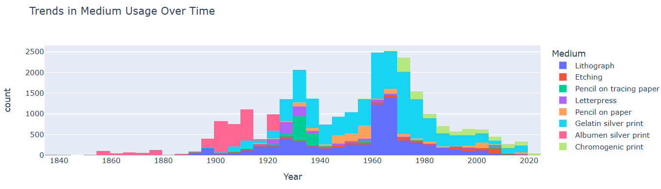
Challenge
By now, you should have gained a basic understanding of the logic behind Python syntax. In your group, discuss how the above code works and what each function, method, and argument does. Play with the arguments, change them, and see what happens.
Keep in mind that all Python libraries, along with their functions and methods, are well-documented. You can read these documentations to understand other people’s code or learn how to implement new libraries in your own code.
To understand how the histogram function from the
plotly.express module works, check out the documentation of
plotly.express.histogram here.
Here’s a line-by-line explanation of the above code:
df = moma_df.copy()- Creates a copy of the DataFrame
moma_dfand assigns it todf. This is often done to preserve the original DataFrame in case you want to modify it without affecting the source. Here, because we are going to manipulate some values inmoma_df, changing their data types and removing rows that contain empty values, we create a copy of it to keep the original DataFrame unchanged.
df['Date'] = pd.to_numeric(df['Date'], errors='coerce')- The dates in the “Date” column are objects. This line of code converts the values in the ‘Date’ column to numeric format.
- Any values that can’t be converted (like strings or invalid dates)
are set to NaN (missing values) by
errors='coerce'.
df['Date'] = pd.to_numeric(moma_df['Date'], errors='coerce')- If you remember, the dates in the ‘Date’ column were objects as
moma_df.info()showed. This line of code converts the values in the ‘Date’ column to numeric format. - Any values that can’t be converted (like strings or invalid dates)
are set to NaN (missing values) by
errors='coerce'.
top_media = df['Medium'].value_counts().nlargest(8).index-
df['Medium']selects the “Medium” column from the DataFramedf, which contains the artistic media for each artwork. -
.value_counts()counts the number of occurrences of each unique value in the “Medium” column (i.e., how many artworks belong to each medium). -
.nlargest(8)selects the top 8 most frequent media types based on their counts. -
.indexextracts the index (the actual medium types) from the result ofnlargest, which gives us the top 8 artistic media.
medium_df = df[moma_df['Medium'].isin(top_media)]-
df['Medium'].isin(top_media)checks which rows in the “Medium” column ofmoma_dfcontain one of the top 8 media from thetop_medialist. - The result is stored in a new DataFrame called
medium_df, which contains only the artworks with the top 8 most frequent media.
fig = px.histogram(medium_df, x='Date', color='Medium', nbins=50, title='Trends in Medium
Usage Over Time', labels={'Date': 'Year', 'count': 'Number of Artworks'})
The px.histogram() function from
plotly.express creates a histogram. It takes the following
arguments:
-
medium_df: The data to visualize (i.e., the filtered DataFrame with the top 8 media) -
x='Date': The variable to be plotted on the x-axis, which is the “Date” column. This represents the year each artwork was created. -
color='Medium': This argument colors the bars by the “Medium” column, so you can distinguish between the different artistic media. - When you set the X-axis to the
Datecolumn inmedium_dfand the bar colors to the top 8 media,Plotly Expressautomatically counts the occurrences of each artistic medium and plots them on the Y-axis. Therefore, it is not necessary to explicitly specify the column frommedium_dfthat should be plotted on the Y-axis. -
nbins=50: Specifies the number of bins for the histogram (i.e., how the years will be grouped). -
title='Trends in Medium Usage Over Time': The title of the plot.
fig.update_xaxes(title_text='Year')
fig.update_yaxes(title_text='Number of Artworks')
These lines set the title of the X-axis to “Year” and the title of the Y-axia to “Number of Artworks.”
fig.show()- This line displays the plot created by
plotly.express. It renders the histogram in an interactive format, allowing you to hover over the bars to view detailed information.
Try reading and interpreting the graph. Explain what it shows in simple, natural language. Based on the graph, draw a conclusion about MoMA’s collection.
Challenge
Now, let’s visualize a second graph using the MoMA database. This time, the process will be a bit more complex. It’s up to you to understand the functionality of the code and what information the resulting graph represents.
PYTHON
df = moma_df.copy()
df['Date'] = pd.to_numeric(df['Date'], errors='coerce')
df = df.dropna(subset=['Date', 'Nationality'])

grouped = df.groupby(['Date', 'Nationality']).size().reset_index(name='Count')
top_nationalities = df['Nationality'].value_counts().nlargest(7).index
grouped = grouped[grouped['Nationality'].isin(top_nationalities)]

fig = px.scatter(grouped, x='Date', y='Nationality', size='Count', color='Nationality',
                 title='Frequency of Artworks by Nationality Over Time')

fig.update_xaxes(title_text='Year')
fig.update_yaxes(title_text='Nationality')

fig.show()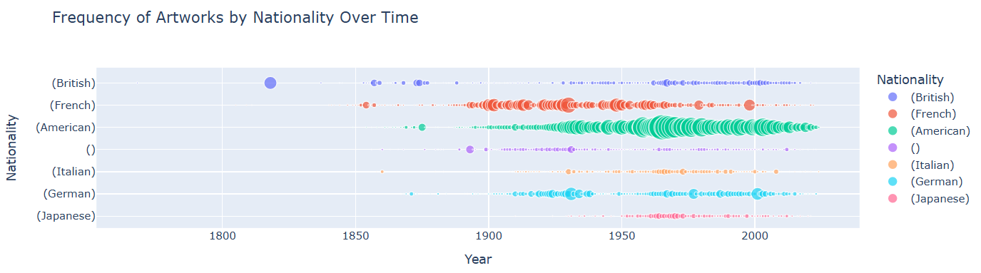
df = df.dropna(subset=['Date', 'Nationality'])- Removes rows from
dfwhere either ‘Date’ or ‘Nationality’ is missing (NaN). - Ensures that the data used for analysis is clean and has valid date and nationality info.
grouped = df.groupby(['Date', 'Nationality']).size().reset_index(name='Count')- This line should already be familiar to you. It groups the cleaned DataFrame by ‘Date’ and ‘Nationality’.
-
.size()counts how many entries fall into each group. -
.reset_index(name='Count')turns the grouped result into a new DataFrame with columns: ‘Date’, ‘Nationality’, and ‘Count’.
top_nationalities = df['Nationality'].value_counts().nlargest(7).index- Finds the 7 most common nationalities in the dataset by counting occurrences in the ‘Nationality’ column.
- Returns the index (i.e. the nationality names) of the top 7.
grouped = grouped[grouped['Nationality'].isin(top_nationalities)]- Filters the
groupedDataFrame to only include rows where the ‘Nationality’ is one of the top 7 most frequent ones. - Helps focus the plot on the most represented nationalities.
fig = px.scatter(grouped, x='Date', y='Nationality', size='Count', color='Nationality',
                 title='Frequency of Artworks by Nationality Over Time',
                 labels={'Date': 'Year'})
fig.show()- Uses
plotly.express(px) to create a scatter plot.-
x='Date': places dates on the x-axis. -
y='Nationality': places nationalities on the y-axis. -
size='Count': size of the points represents how many artworks fall into each (date, nationality) combo. -
color='Nationality': assigns different colors to different nationalities.
-
-
title: sets the chart title. -
labels={'Date': 'Year'}: renames the x-axis label. -
fig.show(): displays the interactive plot.
A scatter plot is a type of chart that shows the relationship between two numerical variables. Each point on the plot represents one observation in the dataset, with its position determined by two values — one on the x-axis and one on the y-axis.
Scatter plots are useful for:
- Checking if there’s a relationship or pattern between two variables
- Seeing how closely the variables are related (positively, negatively, or not at all)
- Detecting outliers or unusual data points
The Data Visualization Workflow:
By now, you should have developed a basic understanding of the data visualization workflow. You can infer this from the two visualization exercises we completed above. When visualizing data, we generally follow these steps:
Identify the features of the dataset we want to analyze and the relationships between them that are of interest to us.
Choose the appropriate graph type based on the goal of our analysis, and decide which Python library we will use to create it (e.g., Matplotlib, Seaborn, Plotly).
Extract the relevant data - the specific values and features we plan to visualize - from the original dataset, and store it in a separate variable for clarity and ease of use.
-
Create the graph. Graphs in Python offer many customizable elements, and we can map different dataset features to these graphical properties. In the case of histograms and scatter plots (which we’ve used here), common properties include:
- The values along the X and Y axes
- The size of the bars (in histograms) or dots (in scatter plots)
- The color of the bars or dots
- Formulate appropriate research questions when working with tabular data.
- Identify the quantitative analysis methods best suited to answering these questions.
- Break down the analysis into smaller tasks, translate them into computer logic using pseudocode, and implement them in Python code.
- Learn about Python functions and methods.
- Learn about histograms.
- Use
pandasfor counting and searching values in tabular datasets. - Use
plotly.expressfor visualizing tabular data.