Data Visualization with Python for Statistical Inference and Storytelling
Last updated on 2026-03-02 | Edit this page
Overview
Questions
- How can you create scatter plots, bubble charts, and correlograms with Python?
- How can these graphs be implemented in data storytelling?
- How can you infer statistical information from a dataset, using these visualizations?
- How can these visualizations contribute to humanists research?
Objectives
- Create scatter plots, bubble charts and correlograms in Python, using the Seaborn library.
- Implement data visualization for exploratory analysis of a concrete dataset and tell a story based on the trends that it reveals.
- Use data visualization to infer information from a concrete dataset.
- Reflect on the use cases of data visualization in humanities research.
In the previous episodes, we explored ten types of graphs and their use cases, as well as the concepts of correlation and regression in the context of inferential statistics. Now, it’s time to put this knowledge into practice!
In this episode, we’ll work with the Income and Happiness Correlation dataset from Kaggle (see the Setup episode), which consists of 111 data points. We will explore the dataset through various graphs and use them to craft a narrative around the data. In the final exercise, you will enhance this narrative by inferring information that is not yet present in the dataset.
Note
Before visualizing any dataset, it’s important to answer the following questions:
- What kind of data is stored in the dataset?
- What are the dimensions of the dataset?
- Why do I want to visualize the dataset? What information do I hope to gain through visualization? And which type of graph best represents the information I’m looking for?
Let’s answer these questions for our dataset by writing some code.
4.1. Exploring the Dataset
The dataset we’re working with is stored in a CSV (comma-separated
values) file on GitHub. Let’s load it into our notebook and store it in
a pandas DataFrame named happy_df:
PYTHON
import pandas as pd

# path to the dataset:
url= "https://raw.githubusercontent.com/carpentries-incubator/hermes_stat_inf_data_vis/main/episodes/data/income_happiness_correlation.csv"

# loading the dataset and storing it in a pandas DataFrame:
happy_df= pd.read_csv(url)

# displaying the first five rows of the DataFrame:
happy_df.head()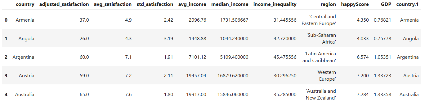
Take a moment to examine the first five rows of the DataFrame. What types of values do you see in each column? Which columns contain numerical values, and which contain categorical values? What information does the dataset include, and what information might be missing?
Run the following line of code to gain more information about the
structure of happy_df:
Question
Which column contains values that could be dependent on other features, and thereby correlates with them? Would it be possible to predict the values of this column, given the values of one or more other columns in the dataset?
Intuitively, one might assume that the happyScore column
contains values that could be predicted based on the other features. So,
it may be possible to estimate the average happiness score of a
country’s population if we know its region, GDP, income inequality, and
average income. In other words, there might be a correlation between
happyScore and the other features.
But how can we determine with greater confidence that such a
correlation exists, and identify which features are more strongly
correlated with happyScore than others? Data visualization
can help us answer these questions.
4.2. Drawing Heatmaps
One of the best and easiest ways to visualize correlations is through
correlographic heatmaps. However, heatmaps can only show how changes in
one numerical value are correlated with changes in another
numerical value. Therefore, to create a heatmap of all
numerical features that could be correlated with
happyScore, we need to exclude the columns in
happy_df that contain non-numerical values:
PYTHON
# selecting only the columns whose values are not of type 'object' and storing them in a new DataFrame:
numerical_df= happy_df.select_dtypes(exclude=['object'])

# displaying the first five rows of the new DataFrame:
numerical_df.head()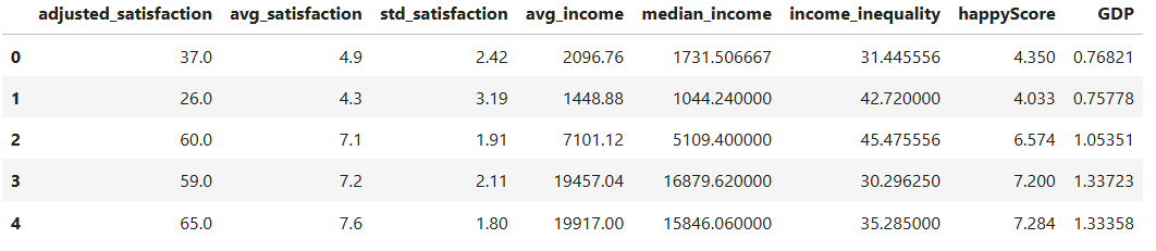
Now, let’s use the Python library Seaborn to create a heatmap of
all the values in numerical_df:
PYTHON
import matplotlib.pyplot as plt
import seaborn as sns

# creating a matrix that contains the correlation of every feature in the DataFrame with every other feature:
corr= numerical_df.corr(method='pearson')

# defining the size of the graph:
plt.figure(figsize=(9, 7))

# generating a heatmap of the corr matrix, using the seaborn library:
sns.heatmap(corr, annot=True, fmt=".2f", cmap='coolwarm', cbar=True)

# giving the graph a title:
plt.title('correlation heatmap')

# diyplaying the graph:
plt.show()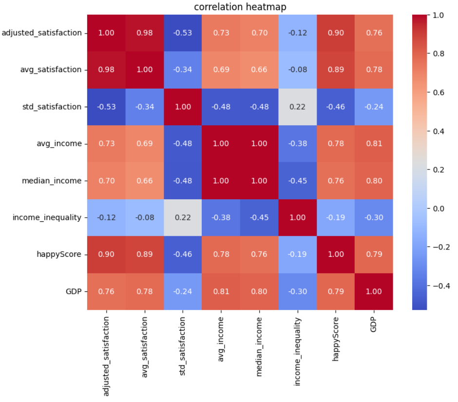
In the code above, we’ve set cmap='coolwarm'. This means
we want the heatmap to distinguish between negative and positive
correlations using red and blue colors. More saturated shades of blue or
red indicate stronger negative or positive correlation values
We’ve set annot=True in our code, which means we want
the correlation coefficients to be displayed on the heatmap. The
correlation coefficients are calculated using the Pearson method in
corr= numerical_df.corr(method='pearson').
“The Pearson correlation measures the strength of the linear relationship between two variables. It has a value between -1 to +1, with a value of -1 meaning a total negative linear correlation, 0 being no correlation, and +1 meaning a total positive correlation.” (ScienceDirect)
How to read and interpret the heatmap:
- Darker red colors, accompanied by values closer to +1, indicate stronger positive correlations. This means that as one value increases at a certain rate, the other increases at a similar rate.
- Darker blue colors, accompanied by values closer to -1, indicate stronger negative correlations. This means that as one value increases at a certain rate, the other decreases at a similar rate.
Question
What patterns does the heatmap above reveal?
- Each feature is most strongly correlated with itself, with a correlation coefficient of +1.
- Values derived from the same feature demonstrate a high correlation.
For example, the correlation coefficient between
avg_satisfactionandadjusted_satisfactionis +0.98, because both stem from the satisfaction degree. The same is true aboutavg_incomeandmedian_incomewith the correlation coefficient being +1.
To create a more precise graph without redundant information, let’s retain only one column from the DataFrame that contains data on satisfaction or income, and remove the others:
PYTHON
# dropping a list of columns from numerical_df and storing the result in a new DataFrame:
reduced_numerical_df= numerical_df.drop(['adjusted_satisfaction', 'std_satisfaction', 'median_income'], axis=1)

reduced_numerical_df.head()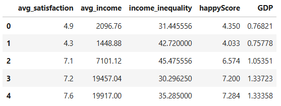
Let’s create the heatmap again, this time using
reduced_numerical_df insted of
numerical_df:
PYTHON
corr= reduced_numerical_df.corr(method='pearson')
plt.figure(figsize=(5.5, 4))
sns.heatmap(corr, annot=True, fmt=".2f", cmap='coolwarm', cbar=True)
plt.title('reduced correlation heatmap')
plt.show()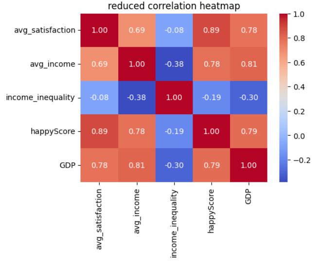
Insight
This heatmap is more meaninful than the previous one and reveals more insights:
-
avg_satisfactionandavg_incomehave a correlation greater that +0.5, indicating that higher income is correlated with greater life satisfaction. - There is a strong positive correlation between
avg_satisfactionandhappyScore. -
avg_satisfactionshows a positive correlation withGDP. - There is a positive correlation between
avg_incomeandhappyScore. - There is a positive correlation between
avg_incomeandGDP. - The slight negative correlation between
avg_incomeandincome_inequalityis also interesting: as the average income in a country increases, income inequality tends to decrease. - There is a negative correlation between
GDPandincome_inequality: higher GDP in a country is associated with lower income inequality.
Let’s now take a closer look at the correlations we’ve observed
between the happyScore and the other features by drawing
different graphs.
4.3. Drawing Scatter Plots
Now that we have a general understanding of the correlations within
the happy_df dataset, let’s take a closer look at these
relationships. We’ll start by visualizing the correlation between
happyScore and another variable with a strong positive
correlation, such as GDP. To achieve this, we can create a
scatter plot:
PYTHON
# defining the size of the graph:
plt.figure(figsize=(8, 4))

# creating a scatte plot, using the seaborn library:
sns.scatterplot(data=happy_df, x='GDP', y='happyScore', zorder=3)

"""
The following block of code enhances the visual appeal of the graph:
"""
# adding grid to the plot:
plt.grid(True, zorder=0, color='lightgray', linestyle='-', linewidth=0.3)

# removing all spines (edges):
sns.despine(left=True, bottom=True)

# setting the background color:
plt.gca().set_facecolor('whitesmoke')
"""
End of customization
"""

# giving the graph a title:
plt.title('correlation between GDP and happyScore')

# diyplaying the graph:
plt.show()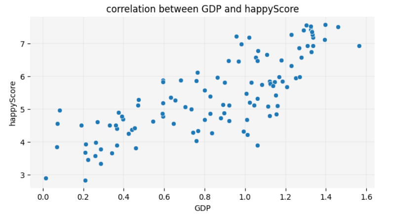
Fun Fact
You are now one step away from understanding how machine learning models predict values. Such a model calculates relationships between features, as shown above, and fits a line to represent them. This involves drawing a line on the scatter plot so that the sum of the squared distances from each point to the line is minimized. This line, as you learned in the previous chapter, is called a regression line. The method used to calculate the line’s position is known as linear regression in statistics. Here is the code to display the regression line on the graph:
PYTHON
plt.figure(figsize=(8, 4))

sns.scatterplot(data=happy_df, x='GDP', y='happyScore', zorder=3)

plt.grid(True, zorder=0, color='lightgray', linestyle='-', linewidth=0.3)
sns.despine(left=True, bottom=True)
plt.gca().set_facecolor('whitesmoke')

# adding a regression line to the graph:
sns.regplot(data=happy_df, x='GDP', y='happyScore', scatter=False, color='red', line_kws={'zorder': 2, 'linewidth': 0.7})

plt.title('GDP vs. happyScore with regression line')
plt.show()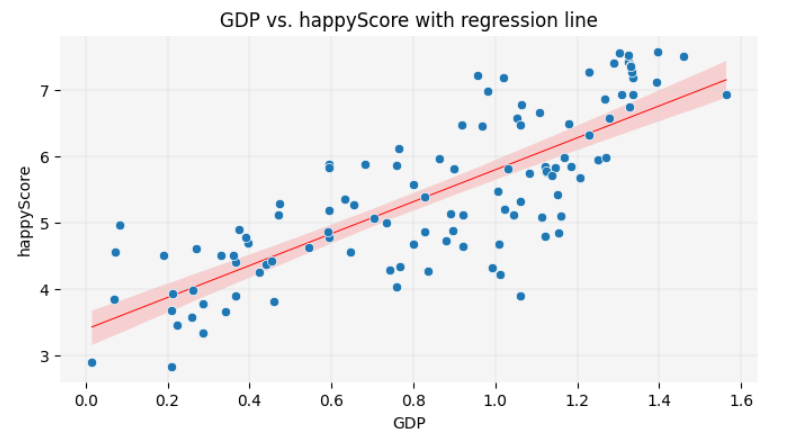
In this lesson, you will not learn the exact formula for calculating the position of the regression line or making precise predictions based on it. However, visualizing the regression line remains a valuable tool in data storytelling. It allows you to make approximate guesses about certain values not present in the dataset by inferring them from the available data. You will have the opportunity to practice this skill at the end of this episode.
The scatter plot reconfirms the insights we gained from the heatmap,
visually demonstrating the positive correlation between GDP
and happyScore: as the value of GDP on the
X-axis increases, the happyScore on the Y-axis also tends
to increase.
What if we also wanted to visualize the region of each country
represented by a dot in the scatter plot? Unlike the heatmap, which
couldn’t display regions due to their categorical nature, the scatter
plot allows us to assign a unique color to each region. This way, we can
see which regions tend to have the highest GDP and
happyScore values:
PYTHON
plt.figure(figsize=(8, 4))

# adding region to the graph as hue:
sns.scatterplot(data=happy_df, x='GDP', y='happyScore', hue='region', palette='Paired', alpha=0.8, zorder=3)

plt.grid(True, zorder=0, color='lightgray', linestyle='-', linewidth=0.3)
sns.despine(left=True, bottom=True)
plt.gca().set_facecolor('whitesmoke')

# adding a legend to the graph:
plt.legend(title='Region', title_fontsize='10', fontsize='9', bbox_to_anchor=(1.05, 1), loc='upper left')

plt.title('correlation between GDP, region and happyScore')
plt.show()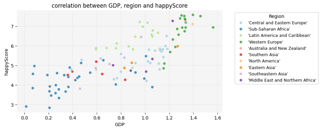
Insight
Interesting! Here are some observable trends in the graph:
- Sub-Saharan African countries have the lowest
GDPs, whereas Western European and North American countries have the highest. However, there are countries in the former region in which thehappyScoreis as high as in some Western European countries, regardless of their very lowGDP. -
GDPis highest in Western European countries. However,happyScorein a considering number of them is similar to Latin American countries and Caribbean, even thoughGDPin these latter regions is lower. - The variation in happiness levels within the same region is greatest
among Western European countries, although they all fall into the
highest
GDPcategory.
Take a closer look at the graph and see if you can identify any additional trends.
4.4. Drawing Bubble Charts
Let’s add one more variable to the graph to explore how
avg_income is distributed across different regions and how
it correlates with region, GDP and
happyScore. We’ll add avg_income as the node
size in the scatter plot, creating a bubble chart:
PYTHON
plt.figure(figsize=(8, 5))

# adding avg_income to the graph as node size:
sns.scatterplot(data=happy_df, x='GDP', y='happyScore', hue='region', size='avg_income', sizes=(20,500), palette='Paired', alpha=0.6, zorder=3)

plt.grid(True, zorder=0, color='lightgray', linestyle='-', linewidth=0.3)
sns.despine(left=True, bottom=True)
plt.gca().set_facecolor('whitesmoke')
plt.legend(fontsize='9', bbox_to_anchor=(1.05, 1), loc='upper left')

plt.title('correlation between GDP, region, avg_income and happyScore')
plt.show()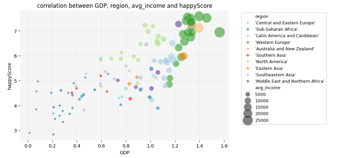
Insight
Here, another interesting trend emerges: average income only begins to increase significantly once GDP exceeds a value of 1.
What additional insights can you derive from this graph? Consider
exploring patterns such as which regions have high
happyScore values relative to avg_income. You
might also observe whether certain regions exhibit consistent patterns
between avg_income and happyScore despite
differences in GDP.
4.5. Diving Deeper into Details
As a final step in our exploration, let’s focus on the countries in
Sub-Saharan Africa to identify which ones have a low GDP
but a high happyScore:
PYTHON
# selecting only the countries that belong to the Sub-Saharan Africa and storing them in a new DataFrame:
african_df= happy_df[happy_df['region']=="'Sub-Saharan Africa'"]

african_df.head()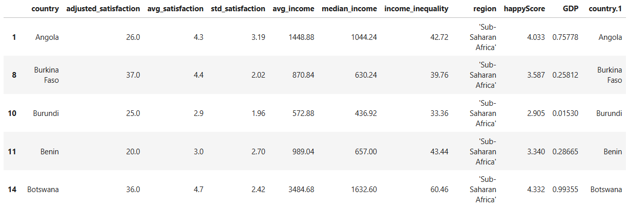
PYTHON
plt.figure(figsize=(10, 7))

sns.scatterplot(data=african_df, x='GDP', y='happyScore', size='avg_income', sizes=(20, 200), alpha=0.6, zorder=3)

plt.grid(True, zorder=0, color='lightgray', linestyle='-', linewidth=0.3)
sns.despine(left=True, bottom=True)
plt.gca().set_facecolor('whitesmoke')

# adding country names to the nodes:
for i in range(len(african_df)):
    plt.text(
        african_df['GDP'].iloc[i],
        african_df['happyScore'].iloc[i]+0.03,
        african_df['country'].iloc[i],
        fontsize=7,
        ha='center',
        va='bottom'
    )

plt.legend(fontsize='9', bbox_to_anchor=(1.05, 1), loc='upper left')
plt.title('correlation between GDP, avg_income and happyScore in Sub-Saharan Africa')
plt.show()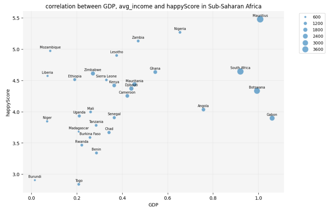
Question
The scatter plot reveals that some economically poor countries in
Sub-Saharan Africa, such as Mozambique and Liberia, have a low
GDP and avg_income but still demonstrate a
high happyScore. But didn’t the heatmap that we created
earlier show a positive correlation between happiness and GDP? Isn’t
this a contradiction?!
Yes and no! Remember, we excluded categorical data, such as region
and country names, from happy_df to create the heatmap. By
analyzing only numerical values, we observed a generally positive
correlation between GDP and happyScore.
However, the scatter plots and bubble chart suggest that maybe cultural
factors specific to each country are significantly correlated with
happiness. This impact is especially visible among Sub-Saharan African
countries.
Therefore, if we want to draw an inferential conclusion from our
observations, it would be this: happiness appears to be influenced by a
combination of GDP, income, and cultural factors. To predict a country’s
happyScore based on our findings, we would need to know its
region (which reflects GDP and cultural context) and possibly the
country’s average income level.
4.6. Exercise
Take two countries that are not listed in the DataFrame, for example
Iran and Turkey. Given the correlations that we have so far detected in
the dataset, try to predict how high their happyScore is.
To do so, you need the following information:
- Which region do these countries belong to? Which countries in
happy_dfare culturally more similar to Iran and Turkey? - How high are
GDPandavg_incomein these countries?
look at the scatter plot with a regression line and the bubble chart
and try to predict where the happy_scores of these two
countries, Iran and Turkey, would be placed on the chart.
- Draw scatter plots, bubble charts and correlograms in Python, using the Seaborn library.
- Implement data visualization for exploratory analysis of a concrete dataset and telling a story based on the trends that it reveals.
- Use data visualization to infer information from a concrete dataset.