Analyzing Network Data
Last updated on 2026-03-02 | Edit this page
Overview
Questions
- What are networks in the sense that we mean in network analysis?
- What is the structure of a network like and what kind of data can be treated as network data?
- What is the difference between network analysis and network visualization?
- When is it meaningful to perform network anaylsis and network visualization?
Objectives
- Learn the basics of network science and network analysis.
- Learn about the structure of network data.
- Learn to visualize networks.
1. Basics of Network Analysis
What are Network Science and Network Analysis?
Network Science is an interdisciplinary field that studies complex networks, which are structures comprised of interconnected nodes (or vertices) and edges (or links). These networks can represent various real-world systems such as social networks (for example on social media), transportation networks, biological networks, and more. The aim of network science is to understand the topological structure of networks and the relationships that can be discovered within them.
Network Analysis refers to the methods and techniques used to study and evaluate networks. It involves identifying patterns, measuring node importance, analyzing connectivity, and understanding the underlying structure and function of the network.
When and With Which Type of Data is Network Analysis Useful?
Network analysis is particularly useful when the data can be
represented as relationships or interactions between entities. Any type
of data with this quality can be transformed into network data. Network
data is nothing but a tabular dataset with at least two columns: a
source column and a target column. Each of
these columns contains the names of the entities that are connected to
each other in the network. Other columns can contain more information
about the connection between source and
target, including the weight of this connection
(identifying how strong it is) or its type (for example, whether it is a
connection between a human and a work of art, or one between two
humans).
In a visualized network, the sources and targets (usually represented
by dots in the graph) are called nodes, and the lines
connecting them are called edges.
Major Types of Networks
There are many different network types. Familiarity with them helps you decide in the future, when working with your own data, what network type your data can be converted to in order to optimally analyze its different features.
Some important network types include:
1. Directed vs. Undirected Networks
Directed Networks: In these networks, the edges have a direction, indicating a one-way relationship between nodes. For example, in a citation network, if Paper A cites Paper B, the link goes from A to B but not necessarily in the reverse direction.
Undirected Networks: Here, the edges do not have a direction, representing a symmetric relationship. An example would be a friendship network where two people are friends with each other, and the relationship is mutual.
2. Weighted vs. Unweighted Networks
Weighted Networks: In weighted networks, edges have weights assigned to them, indicating the strength or capacity of the relationship. For instance, in a transportation network, the weights could represent distances or travel times.
Unweighted Networks: These networks have edges that are simply present or absent, with no additional information about the strength of connections. An example is a simple social network where the only consideration is whether or not a connection exists.
3. Bipartite Networks
Bipartite networks consist of two distinct sets of nodes, and edges only connect nodes from different sets. An example is a movie recommendation system, where one set consists of users and the other set consists of movies.
4. Homogeneous vs. Heterogeneous Networks
Homogeneous Networks: These networks consist of nodes of the same type. An example is a social network where all nodes represent people.
Heterogeneous Networks: In these networks, nodes can represent different types of entities. For instance, a scientific citation network can include papers, authors, and journals as different types of nodes.
2. Visualizing Network Data
As mentioned above, network data is a specific form of tabular data. For the analyses in this lesson, I have extracted some network data from the website of Wikidata, using the programming language SPARQL. For this lesson, it is not necessary to understand how SPARQL works.
The dataset is stored in a CSV file. It represents a table composed
of two columns: source and target. Both
columns contain names of mostly European personalities. This table was
constructed to represent a directional network, meaning that the
philosophers and thinkers that appear in the source column
have influenced the work of those in the target column.
To construct this dataset, I have searched Wikidata for people whose work has been influenced by Karl Marx, Georg Wilhelm Friedrich Hegel, Immanuel Kant, Benedictus de Spinoza, René Descartes, Plato, or Aristotle, as well as those who have influenced the work of these philosophers. Therefore, these seven personalities make up the most important nodes in the network.
Let’s read the data into Jupyter Notebook, convert it to a Pandas dataframe, and display a sample of that dataframe with ten rows:
PYTHON
import pandas as pd

data_url='https://raw.githubusercontent.com/HERMES-DKZ/python_101_humanities/main/episodes/data/influence_network.csv'
influence_df = pd.read_csv(data_url)
influence_df.sample(10)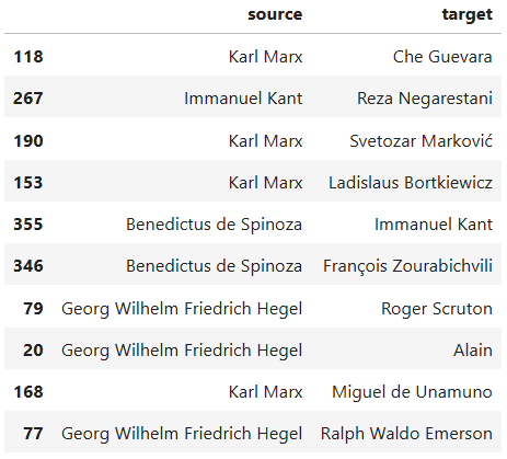
Now let’s write some Python code that visualizes the network graph for us:
PYTHON
import networkx as nx
from pyvis.network import Network

# Step 1: Build the NetworkX graph
G = nx.DiGraph()

# Add nodes
all_nodes = set(influence_df['source']).union(set(influence_df['target']))
G.add_nodes_from(all_nodes)

# Add edges
for _, row in influence_df.iterrows():
    G.add_edge(row['source'], row['target'])

# Step 2: Create a PyVis network
net = Network(directed=True, height='1000px', width='100%')

# Import the NetworkX graph
net.from_nx(G)

# Step 3: Apply your original visual styling

highlighted = {
    'Karl Marx',
    'Georg Wilhelm Friedrich Hegel',
    'Immanuel Kant',
    'Benedictus de Spinoza',
    'René Descartes',
    'Plato',
    'Aristotle'
}

for node in net.nodes:
    if node['id'] in highlighted:
        node['color'] = 'orangered'
    else:
        node['color'] = 'slategrey'

for edge in net.edges:
    edge['color'] = 'darkseagreen'
    edge['arrows'] = 'to'

# Step 4: Save output
net.save_graph("influence_network.html")
print("FINISHED! Network saved as 'influence_network.html'.")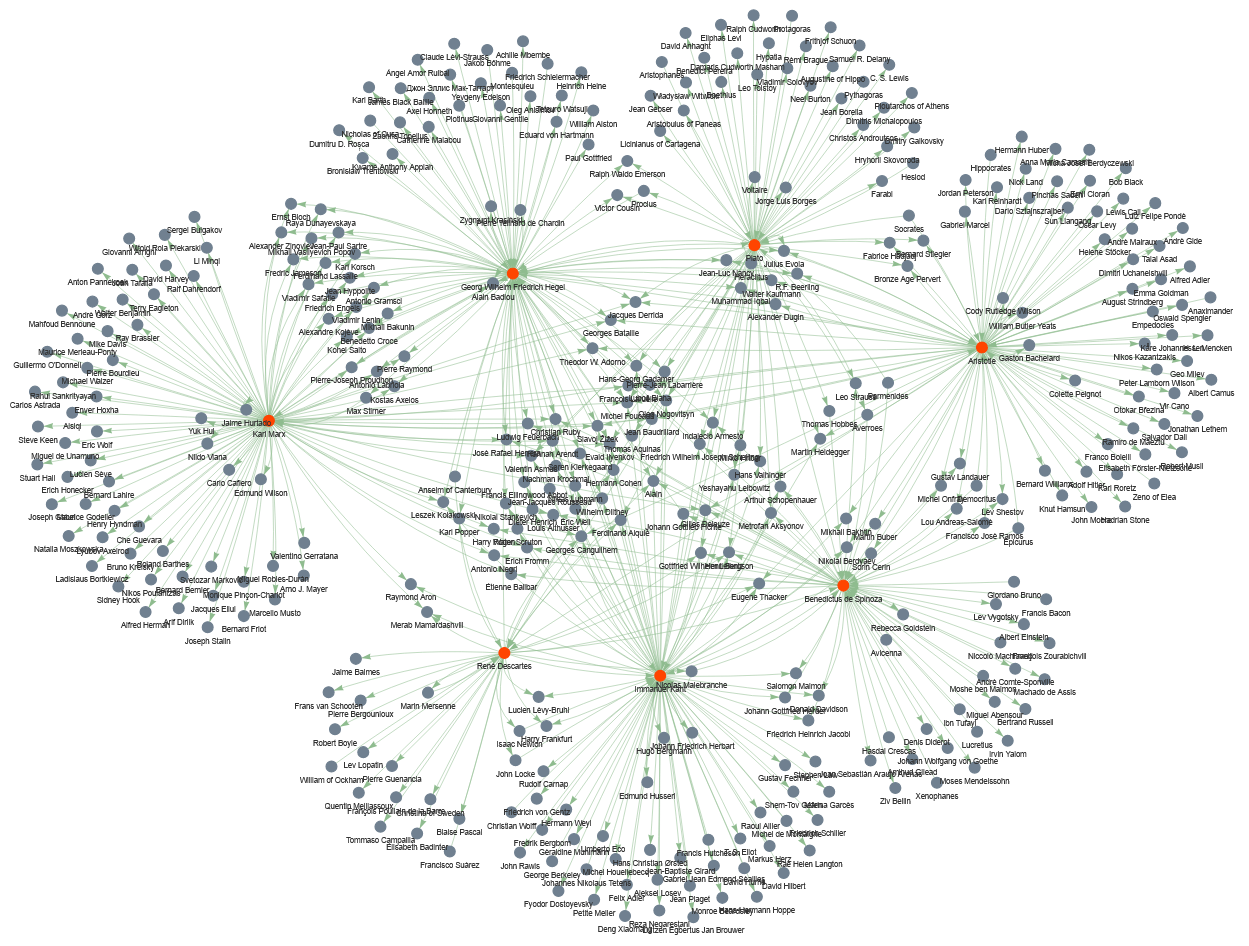
Don’t worry if the network that you have visualized in your code
doesn’t look exactly like the one displayed here. Pyvis
creates interactive network graphs, so that you can pull the nodes
around with the mouse and change their constellation.
Let’s analyze the code line by line
First, let’s look at what is happening at each step:
- Build the
NetworkXgraph: Creates a directed graphG, collects unique node names frominfluence_df, and adds directed edges from source → target. - Create a
PyVisnetwork: Builds an interactive visualization object net (browser-friendly) and imports theNetworkXgraph into it. - Apply visual styling: Colors a chosen set of important nodes (highlighted) differently, sets a color and arrow style for every edge.
- Save output: Writes the interactive HTML file
influence_network.htmland prints a short completion message.
Now, let’s look more deeply into what each code chunk does:
import networkx as nx
from pyvis.network import Network
Imports the NetworkX library under the name
nx — used for building and manipulating graphs. Imports
Network from PyVis, a class for creating
interactive network visualizations that open in a browser.
# Step 1: Build the NetworkX graph
G = nx.DiGraph()
Creates an empty directed graph object G (edges have
direction).
# Add nodes
all_nodes = set(influence_df['source']).union(set(influence_df['target']))
Collects all unique node names: takes the source column
and target column from influence_df, converts
each to a set, and unions them so each node appears once.
G.add_nodes_from(all_nodes)Adds every element of all_nodes as a node in the graph
G.
# Add edges
for _, row in influence_df.iterrows():
    G.add_edge(row['source'], row['target'])
Loops over each row of influence_df. For each row, reads
source and target and adds a directed edge from source to
target in G. (_ ignores the row index returned
by iterrows().)
# Step 2: Create a PyVis network
net = Network(directed=True, height='1000px', width='100%')
Creates a PyVis Network instance net.
directed=True ensures arrows are shown for direction;
height/width set how big the visualization will appear in the
browser.
# Import the NetworkX graph
net.from_nx(G)
Converts the NetworkX graph G into the
PyVis object net, copying nodes and edges so
PyVis can render them interactively.
# Step 3: Apply your original visual styling
highlighted = {
    'Karl Marx',
    'Georg Wilhelm Friedrich Hegel',
    'Immanuel Kant',
    'Benedictus de Spinoza',
    'René Descartes',
    'Plato',
    'Aristotle'
}
Defines a Python set named highlighted
containing node labels that should receive special visual styling (these
are the seven featured philosophers mentioned earlier).
for node in net.nodes:
    if node['id'] in highlighted:
        node['color'] = 'orangered'
    else:
        node['color'] = 'slategrey'
Iterates each node in the PyVis representation. In
PyVis, each item in net.nodes is a dictionary
describing one visual node in the interactive network. It contains all
the display attributes PyVis needs to render that node in
the browser. Each dictionary represents one node in your network,
including: - the node’s internal ID (usually the label from the NetworkX
graph) - the text shown next to the node - visual settings such as size,
color, shape, and physics behavior
In each iteration, if the node’s id (its label) is in
highlighted, sets its color to ‘orangered’, otherwise sets
it to ‘slategrey’. This changes node appearance in the HTML output.
for edge in net.edges:
    edge['color'] = 'darkseagreen'
    edge['arrows'] = 'to'
Iterates every edge (each is a dictionary, similar to
net.nodes). Sets the edge color to ‘darkseagreen’ and
ensures an arrowhead points from source to target by setting ‘arrows’ to
‘to’.
# Step 4: Save output
net.save_graph("influence_network.html")
Writes the interactive visualization to the file
influence_network.html. Opening that file in a browser
shows the network with the applied styling.
Visualizing network data is very helpful, because it helps you understand the dataset better and decide what insights it can offer you in your research.
Challenge
Study the visualized graph more closely. This is a directional graph of influence in the realm of European philosophy. With a partner, discuss what questions the visualized dataset can answer. These questions guide the further analytic actions that we will undertake in this lesson.
Below are some of the questions that we could answer using this dataset:
- Among the seven highlighted thinkers based on whom the dataset has been curated, which one has been more influential? Which one has had the least among of influence?
- Which thinkers have been influenced by the largest number of the highlighted thinkers?
- How can the influence of the highlighted thinkers be quantitatively measured?
In the following sections, we will answer the questions above using different network analysis techniques.
3. Measuring the out-degree
The out-degree of a node is the number of arrows going out from that node. In our influence graph, if a philosopher is connected to many others with arrows pointing from them to others, that means they influenced many people. So:
out-degree = how many people a thinker influenced (according to our dataset).
Let’s write a python code that calculates the out-degree of the highlighted seven thinkers:
PYTHON
# List of highlighted thinkers
highlighted = [
    'Karl Marx',
    'Georg Wilhelm Friedrich Hegel',
    'Immanuel Kant',
    'Benedictus de Spinoza',
    'René Descartes',
    'Plato',
    'Aristotle'
]

# Compute integer out-degree safely
influence_counts = {}

for thinker in highlighted:
    influence_counts[thinker] = int(G.out_degree(thinker))

# Identify most and least influential
most_influential = max(influence_counts, key=lambda k: influence_counts[k])
least_influential = min(influence_counts, key=lambda k: influence_counts[k])

print("Influence counts among highlighted thinkers:")
for k, v in influence_counts.items():
    print(f"{k}: {v}")

print("\nMost influential thinker:", most_influential)
print("Least influential thinker:", least_influential)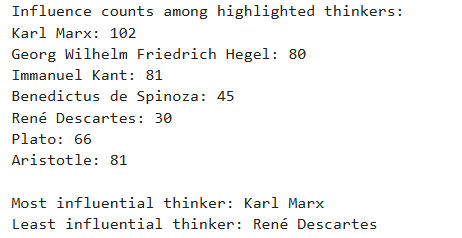
Let’s analyze the code line by line
highlighted = [
    'Karl Marx',
    'Georg Wilhelm Friedrich Hegel',
    'Immanuel Kant',
    'Benedictus de Spinoza',
    'René Descartes',
    'Plato',
    'Aristotle'
]
This line re-defines the highlighted list from the
previous code chunk. The list will be used to loop through these
thinkers later.
influence_counts = {}This line creates an empty dictionary called
influence_counts.
for thinker in highlighted:
    influence_counts[thinker] = int(G.out_degree(thinker))
These lines create a For loop. The loop goes through the
highlighted list one thinker at a time. During each cycle,
the variable thinker holds one name from the list.
influence_counts[thinker] = int(G.out_degree(thinker))
retrieves the thinker’s out-degree from the graph G.
G.out_degree(thinker) returns how many edges point
outward from that thinker.
int(...) ensures that the result is stored as a plain
integer.
The dictionary influence_counts stores this value under
the thinker’s name.
most_influential = max(influence_counts, key=lambda k: influence_counts[k])This line finds the thinker with the highest out-degree.
max(...) selects the key (the thinker) whose value in the
dictionary is largest.
key=lambda k: influence_counts[k] uses a lambda function
that tells Python to compare items based on their stored influence
number.
A lambda function in Python is a very small, short function that you create without giving it a name. Because it has no name, it is called an anonymous function.
It is used when you need a simple function for a short amount of time
and do not want to write a full function with def.
A simple lambda function looks like this:
lambda x: x + 1This means:
- take an input called x
- return x + 1
So if you used it like this:
f = lambda x: x + 1then f(5) would return 6.
In our code, we have:
key=lambda k: influence_counts[k]This means:
- Python is given a tiny function
- The function takes one input,
k - The function returns `influence_counts[k]```
In other words, when Python tries to find the maximum value in the dictionary, it uses the lambda function to tell it: “Look up the value for each thinker and compare those values.”
least_influential = min(influence_counts, key=lambda k: influence_counts[k])This line works the same way as the previous one, but uses
min(...) to find the smallest out-degree. The result is the
thinker who influenced the fewest people in the dataset.
Finally, the last code lines implement functions that you have already learned in the previoius episodes.
So far, we know that Karl Marx has been the most influential among the highlighted personalities in our dataset, whereas the least influential person has been René Descartes. Let’s draw a bar chart to better understand the out-degrees of the seven selected nodes, which gives us a measure of how influential they have been in the world of philosophy and literature.
PYTHON
import plotly.express as px

# Sort philosophers by out-degree (highest → lowest)
sorted_items = sorted(influence_counts.items(), key=lambda x: x[1], reverse=True)

# Unpack the sorted items back into two lists
philosophers = [item[0] for item in sorted_items]
out_degrees = [item[1] for item in sorted_items]

# Create bar plot
fig = px.bar(
    x=philosophers,
    y=out_degrees,
    labels={'x': 'Philosopher', 'y': 'Out-degree'},
    title='Out-degree (Influence Count) of Highlighted Philosophers'
)

fig.show()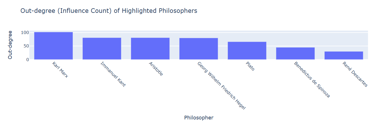
In the above code, only the few first lines merit a brief explanation.
Let’s analyze a few code lines
sorted_items = sorted(influence_counts.items(), key=lambda x: x[1], reverse=True)influence_counts.items() produces all key–value pairs
from the dictionary. Each item looks like: (‘Plato’, 9) or (‘Aristotle’,
6).
sorted(..., key=lambda x: x[1], reverse=True) Sorts
those key–value pairs based on the value (the out-degree).
x represents one pair, such as (‘Plato’, 9).
x[1] selects the second part of the pair, the
out-degree.
reverse=True makes the list sorted from highest to
lowest.
The result, stored in sorted_items, is a list of tuples
ordered by out-degree.
philosophers = [item[0] for item in sorted_items]This creates a new list containing only the names of the
philosophers, in the sorted order. item[0] means “take the
first part of each tuple,” which is the philosopher’s name.
out_degrees = [item[1] for item in sorted_items]This creates another list containing only the out-degree numbers, in
the same sorted order. item[1] means “take the second part
of each tuple,” which is the out-degree.
4. Measuring the in-degree
In the previous section, we measured the out-degrees. In this one, we want to measure the in-degrees to see which thinkers have been influenced by the largest number of the highlighted thinkers, which translates into: which nodes have the highest number of arrows pointing at them. We count, for each node, how many of its incoming edges come from the highlighted thinkers.
Let’s write a Python code that performs the in-degree count for us:
PYTHON
# Step 1: Create a dictionary to count influences from highlighted thinkers
influence_count = {node: 0 for node in G.nodes}

# Step 2: Count how many highlighted thinkers influence each node
for target in G.nodes:
    predecessors = set(G.predecessors(target))  # thinkers influencing this target
    influence_count[target] = len(predecessors.intersection(highlighted))

# Step 3: Find the maximum count
max_influence = max(influence_count.values())

# Step 4: Find the non-highlighted thinkers influenced by the maximum number of highlighted thinkers
most_influenced_thinkers = [
    node for node, count in influence_count.items()
    if count == max_influence and node not in highlighted
]

print("Thinkers influenced by the maximum number of highlighted thinkers:", most_influenced_thinkers)
print("Number of highlighted thinkers influencing them:", max_influence)
Let’s analyze the code line by line
influence_count = {node: 0 for node in G.nodes}G.nodes gives a list of all thinkers (nodes) in the
network.
{node: 0 for node in G.nodes} is a dictionary
comprehension. It creates a dictionary where each thinker starts with a
count of 0, meaning initially we assume no highlighted thinkers
influence them.
for target in G.nodes:
    predecessors = set(G.predecessors(target))  # thinkers influencing this target
    influence_count[target] = len(predecessors.intersection(highlighted))
for target in G.nodes: loops over every thinker in the
network.
G.predecessors(target) gives a list of thinkers who have
an arrow pointing to this thinker — in other words, thinkers who
influenced them.
set(predecessors) converts the list of influencers into
a set for easy comparison.
predecessors.intersection(highlighted) finds which of
the influencers are in our highlighted thinkers set.
len(...) counts how many highlighted thinkers influence
this node.
influence_count[target] = ... updates the dictionary
with this number.
max_influence = max(influence_count.values())influence_count.values() gives all the counts of
highlighted thinkers for each node.
max(...) finds the largest number, i.e., the highest
number of highlighted thinkers influencing a single thinker.
most_influenced_thinkers = [
    node for node, count in influence_count.items()
    if count == max_influence and node not in highlighted
]
The list comprehension
[node for node, count in ... if count == max_influence and node not in highlighted]
creates a list of thinkers whose count equals the maximum. It also makes
sure that the nodes in this list, whose in-degrees are being measured,
do not belong to the highlighted list.
The thinkers in the list most_influenced_thinkers are
those influenced by the highest number of highlighted thinkers.
Wonderful! We now know that Michel Foucault, Alain, and Evald Ilyenkov have taken the greatest influence from the highlighted thinkers. Let’s now create a filtered network dataset, consisting only of these three nodes and the seven highlighted thinkers, and visualize it. This visualization should give us a better understanding of European philosophy’s landscape concerning the seven highlighted thinkers:
PYTHON
import pandas as pd
import networkx as nx
from pyvis.network import Network

# Combine nodes to include in the smaller network
nodes_to_include = highlighted.union(most_influenced_thinkers)

# Step 1: Build the filtered NetworkX graph
G_filtered = nx.DiGraph()

# Add only the relevant nodes
G_filtered.add_nodes_from(nodes_to_include)

# Add edges only if both source and target are in nodes_to_include
for _, row in influence_df.iterrows():
    if row['source'] in nodes_to_include and row['target'] in nodes_to_include:
        G_filtered.add_edge(row['source'], row['target'])

# Step 2: Create a PyVis network
net = Network(directed=True, height='1000px', width='100%')

# Import the filtered NetworkX graph
net.from_nx(G_filtered)

# Step 3: Apply the same visual styling
for node in net.nodes:
    if node['id'] in highlighted:
        node['color'] = 'orangered'
    else:
        node['color'] = 'slategrey'

for edge in net.edges:
    edge['color'] = 'darkseagreen'
    edge['arrows'] = 'to'

# Step 4: Save the filtered network
net.save_graph("filtered_influence_network.html")
print("FINISHED! Filtered network saved as 'filtered_influence_network.html'.")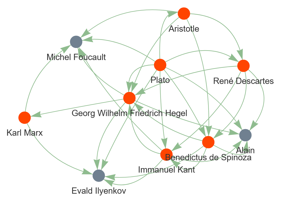
With a peer, study the visualized graph carefully and discuss what information it provides about European philosophy.
5. Measuring centrality degrees
Finally in this episode, let’s answer the third question we stated above: How can the influence of the highlighted thinkers be quantitatively measured? To do so, we can measure three so-called centrality degrees for the nodes in the highlighted list. These are:
- Degree Centrality
- Betweenness Centrality
- Closeness Centrality
Degree Centrality
Definition:
- Measures the number of direct connections a node has to other nodes.
- In a directed graph, degree centrality usually counts both incoming and outgoing edges unless specifically split into in-degree and out-degree centrality.
Why we measure it:
- It shows how “connected” a node is in the network.
- In a social or influence network, a thinker with a high degree centrality either influences many thinkers (high out-degree) or is influenced by many thinkers (high in-degree).
- It is a simple and intuitive measure of a node’s importance in terms of direct connections.
Unit and Range:
- Normalized unitless number that ranges from 0 to 1:
- 0 means no connections, 1 means connected to all other nodes in the network.
Betweenness Centrality
Definition:
- Measures how often a node lies on the shortest paths between other pairs of nodes.
- A node with high betweenness acts as a “bridge” or bottleneck connecting different parts of the network.
Why we measure it:
- Identifies thinkers who are key intermediaries.
- Even if a thinker is not highly connected (low degree), they may control the flow of influence in the network if many shortest paths pass through them.
Unit and Range:
- Normalized unitless number that ranges from 0 to 1:
- 0 means the node is never on a shortest path between any two other nodes.
- 1 means the node is on all shortest paths (rare in real networks).
Closeness Centrality
Definition:
- Measures how close a node is to all other nodes in the network, based on the shortest paths.
- High closeness means a node can quickly interact with (or influence) all other nodes.
Why we measure it:
- Shows which thinkers are “centrally located” in the network.
- A thinker with high closeness can reach many others efficiently, making them influential even without high degree or betweenness.
Unit and Range:
- Normalized unitless number that ranges from 0 to 1:
- 0 means the node is very far from others (or disconnected).
- 1 means the node is as close as possible to all others (rare).
At this stage, you should be at a point where you can understand the following code without any explanation. Congratulations! You’re becoming a profi in Python programming!
Now that you know what information these centrality degrees reveal, let’s measure them for the nodes in the list of highlighted thinkers.
PYTHON
import pandas as pd

# Step 1: Calculate centralities
degree_centrality = nx.degree_centrality(G)
betweenness_centrality = nx.betweenness_centrality(G)
closeness_centrality = nx.closeness_centrality(G)

# Step 2: Collect centralities only for highlighted thinkers
data = []
for node in highlighted:
    data.append({
        'Thinker': node,
        'Degree Centrality': round (degree_centrality[node], 2),
        'Betweenness Centrality': round (betweenness_centrality[node], 2),
        'Closeness Centrality': round (closeness_centrality[node], 2)
    })

# Step 3: Create a pandas DataFrame
centrality_df = pd.DataFrame(data)

# Step 4: Sort by Degree Centrality (optional)
centrality_df = centrality_df.sort_values(by='Degree Centrality', ascending=False).reset_index(drop=True)

centrality_df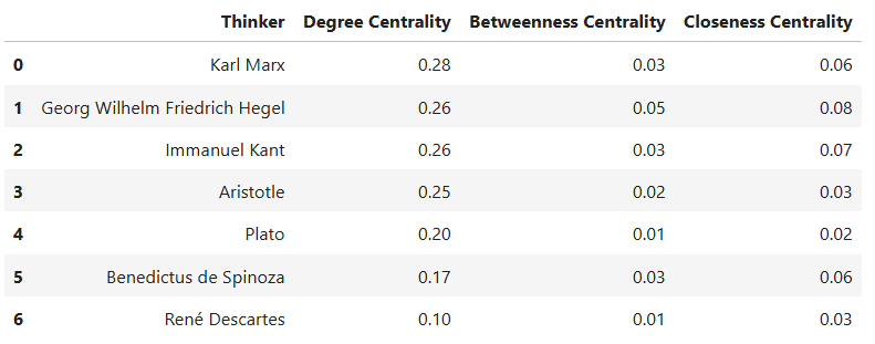
To develop a better understanding of the degree centralities in the dataframe, let’s visualize them in a stacked bar chart:
PYTHON
# Step 1: Transform the DataFrame to long format
centrality_long = centrality_df.melt(
    id_vars='Thinker',
    value_vars=['Degree Centrality', 'Betweenness Centrality', 'Closeness Centrality'],
    var_name='Centrality',
    value_name='Value'
)

# Step 2: Create a grouped bar chart with text above the bars
fig = px.bar(
    centrality_long,
    x='Thinker',
    y='Value',
    color='Centrality',
    barmode='group',
    text='Value',       # Show numeric values
    title='Comparison of Centralities for Highlighted Thinkers',
    height=700
)

# Step 3: Ensure all text values are horizontally above the bars
fig.update_traces(textposition='outside')  # Forces all values above bars

# Step 4: Customize layout
fig.update_layout(
    xaxis_title='Thinker',
    yaxis_title='Centrality (normalized 0-1)',
    legend_title='Centrality Measure',
    yaxis=dict(range=[0, 1]),
    template='plotly_white'
)

# Step 5: Show figure
fig.show()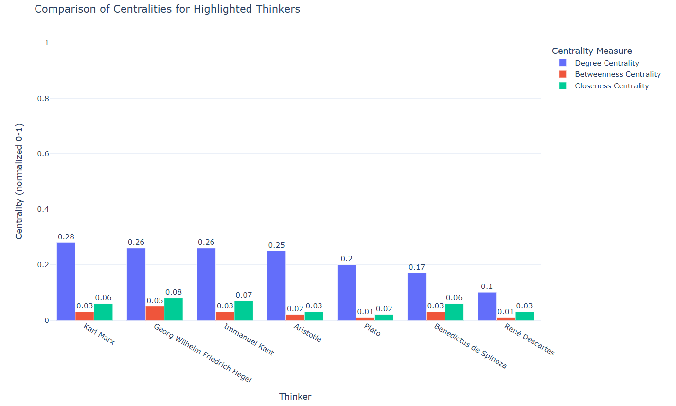
Now that you know what each centrality degree means and you have the measures and graphs regarding the centrality degrees of the seven highlighted thinkers in the network data, discuss with a partner:
- What do these measures mean for the seven selected thinkers?
- Which thinker among the highlighted ones has the highest number of connections?
- Which thinker has most effectively served as a bridge between other thinkers in the network data?
- Which thinker has likely most influenced or been influenced by others in the network?
- Understand the use cases of network analysis.
- Visualize networks using the Python library Pyvis.