Content from Introduction
Last updated on 2025-01-29 | Edit this page
Estimated time: 10 minutes
Overview
Questions
- How can the humanities benefit from data visualization?
- What are some of the most useful graphs for humanities research?
- What is inferential statistics?
- How can python be used for data visualization, to serve statistical inference and data storytelling?
Objectives
After completing this lesson, learners will be able to …
- Understand the use cases of data visualization for the humanities.
- Understand the concept of statistical inference to humanities researchers.
- Visualize data with python to infer information from it.
- Use data visualization and statistical inference for data storytelling.
To warm up, conduct a brief brainstorming session to elicit potential answers to the questions above. Write the answers on the board and engage learners in a discussion about their background knowledge in each area.
Depending on the backgrounds and interest areas of workshop attendees, you can focus on one or the other point from the text below.
Who can benefit from this lesson?
The main goal of this lesson is to demonstrate the importance of data visualization and how it can unlock a variety of learning and research pathways—ranging from exploratory data analysis and statistical inference to understanding machine learning processes and data storytelling.
If you’re looking for ways to approximately predict specific values based on a given dataset for data storytelling, or if you’ve ever wondered how machine learning models that predict values (rather than categories) work, this lesson is for you. It will introduce you to the concept of statistical inference—a mathematical calculation used in predictive machine learning algorithms—through various data visualization techniques. These visualization methods will also enhance your data storytelling skills, not only in describing existing data but also in predicting values based on the available data.
Data visualization is central to this lesson, serving as both the means and the goal. You’ll not only learn to write Python code and engage in hands-on data visualization, but also discover how to explore, understand, and predict dataset values through visualization techniques.
How is this lesson structured?
- The lesson begins with a brief overview of various graph types and their applications.
- Next, you’ll explore statistical inference and linear regression, which will help you understand correlations and make predictions based on datasets. These concepts also provide foundational insights into how machine learning models work.
- Finally, you’ll learn how to use visualization techniques in an exploratory analysis and storytelling process to identify patterns within a dataset and extract statistical insights, bringing together the concepts from the previous sections and engaging in hands-on data visualization in Python.
- Getting to know each other.
- An overview of the lesson structure and objectives.
Content from Graph Categories
Last updated on 2026-03-02 | Edit this page
Estimated time: 90 minutes
Overview
Questions
- Why is data visualization important in humanities research?
- What are some effective graph types for use in humanities research?
Objectives
- Learn about the benefits of data visualization in humanities research.
- Learn some of the most effective graph types for data visualization in the humanities.
This episode is more meant for self study. You don’t need to go into extensive detail about the content of this episode. Instead, focus on reviewing the graphs with the learners and ask if they are already familiar with them and their use cases. The most important graphs to highlight — those that will also be featured in the visualization section of this lesson — are scatter plots, bubble charts, and correlograms. Place greater emphasis on these and prepare the learners to create them in the visualization section.
Question
Why is it helpful to visualize data in humanities research?
Data visualization has multiple purposes. It can help you understand trends and correlations in a dataset. It can also help you introduce a dataset to others in scientific texts or in data storytelling.
Most graphs used for data visualization fall into one of the following four general categories, based on their function. In this lesson, we won’t cover how to create all of these graphs in Python, but will focus on a few that are useful for statistical inference and data storytelling with our specific dataset. However, it’s helpful to know the names of these graphs and understand the contexts in which they can be applied.
2.1. Explore Relationships between two or more Features
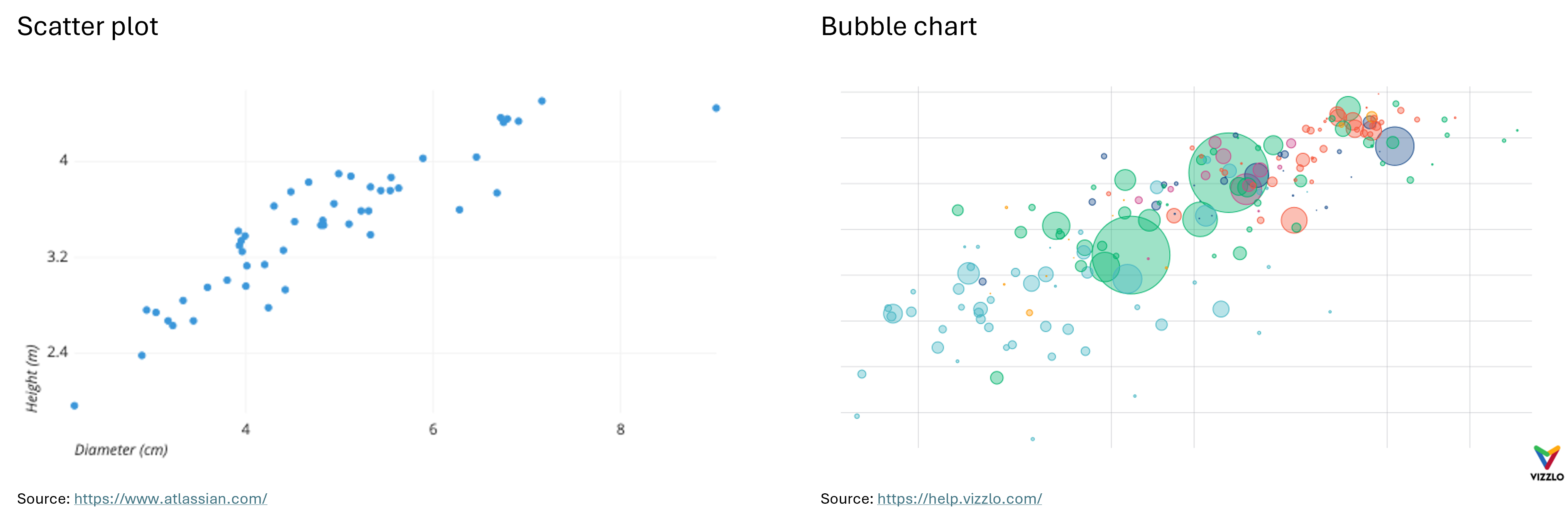
Scatter Plot: “A scatter plot (aka scatter chart, scatter graph) uses dots to represent values for two different numeric variables. The position of each dot on the horizontal and vertical axis indicates values for an individual data point. Scatter plots are used to observe relationships between variables.” (Atlassian) For example, the X-axis can represent the age of the employees at a company, where the Y-axis represents their income.
Bubble Chart: “A bubble chart (aka bubble plot) is an extension of the scatter plot used to look at relationships between three numeric variables. Each dot in a bubble chart corresponds with a single data point, and the variables’ values for each point are indicated by horizontal position, vertical position, and dot size.” (Atlassian) In addition to representing three numerical features with their X and Y values and bubble size, a bubble chart can also represent a categorical feature through color. For example, if the X-axis represents the age of employees at a company, the Y-axis represents their income, and the size of the bubbles represents their years of work experience, the color of the bubbles can indicate their gender.
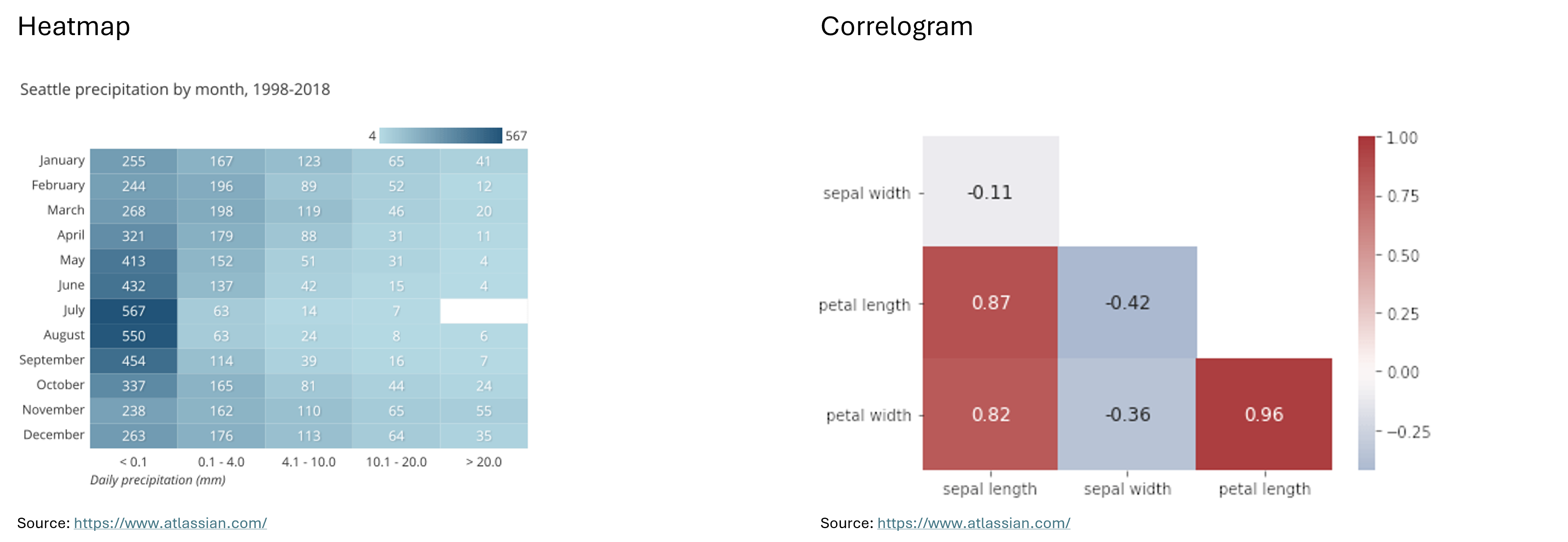
Heatmap: “A heatmap (aka heat map) depicts values for a main variable of interest across two axis variables as a grid of colored squares. The axis variables are divided into ranges like a bar chart or histogram, and each cell’s color indicates the value of the main variable in the corresponding cell range.” (Atlassian)
Correlogram: “A correlogram is a variant of the heatmap that replaces each of the variables on the two axes with a list of numeric variables in the dataset. Each cell depicts the relationship between the intersecting variables, such as a linear correlation. Sometimes, these simple correlations are replaced with more complex representations of relationship, like scatter plots. Correlograms are often seen in an exploratory role, helping analysts understand relationships between variables in service of building descriptive or predictive statistical models.” (Atlassian) For example, a correlogram can reveal the correlations between features such as the sepal width, petal length, and petal width of an iris, showing how closely these attributes are related to each other.
Below you can see examples of a scatter plot, a bubble chart, a heatmap and a correlogram:
2.2. Compare Different Measures or Trends
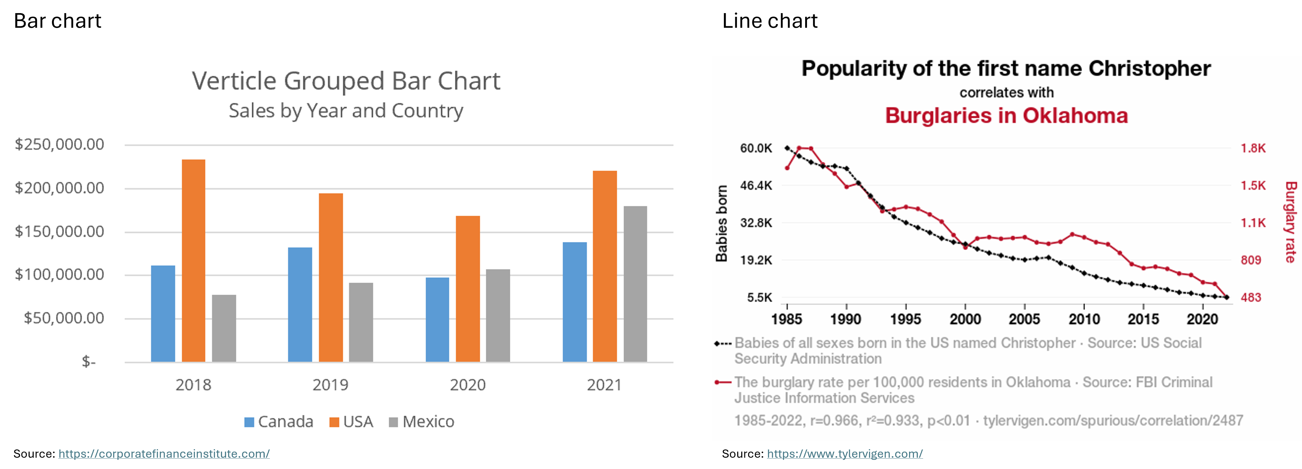
Bar Chart: “A bar chart (aka bar graph, column chart) plots numeric values for levels of a categorical feature as bars. Levels are plotted on one chart axis, and values are plotted on the other axis. Each categorical value claims one bar, and the length of each bar corresponds to the bar’s value. Bars are plotted on a common baseline to allow for easy comparison of values.” (Atlassian) For example, the X-axis could represent the skill levels of employees at a company (entry-level, mid-level, and advanced), while the Y-axis shows the average annual salary for each group.
Line Chart: “A line chart (aka line plot, line graph) uses points connected by line segments from left to right to demonstrate changes in value. The horizontal axis depicts a continuous progression, often that of time, while the vertical axis reports values for a metric of interest across that progression.” (Atlassian) For example, the X-axis could represent the years from 2000 to 2024, while the Y-axis shows the average salary of advanced employees at two different companies over this time period.
Below you can see examples of a bar chart and a line chart.
2.3. Explore Distributions
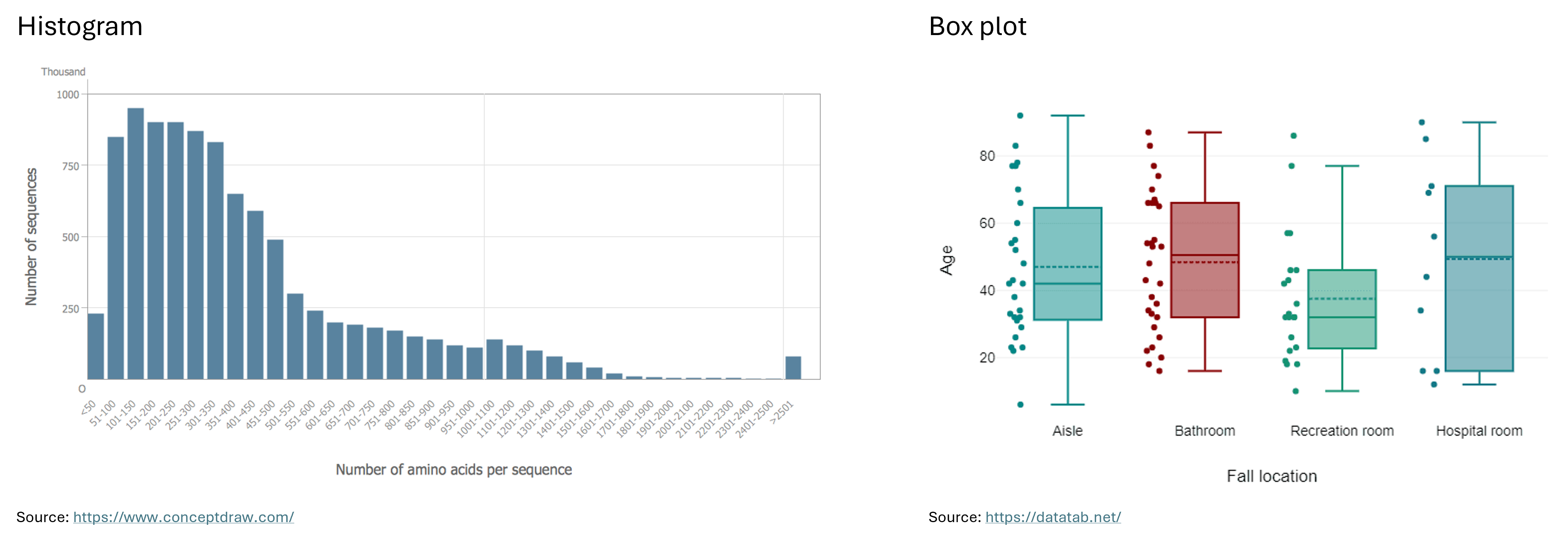
Histogram: “A histogram is a chart that plots the distribution of a numeric variable’s values as a series of bars. Each bar typically covers a range of numeric values called a bin or class; a bar’s height indicates the frequency of data points with a value within the corresponding bin.” (Atlassian) For example, the bins on the X-axis could represent salary ranges such as ¥30,000 - ¥39,999, ¥40,000 - ¥49,999, and ¥50,000 - ¥59,999, with the Y-axis showing the number of Japanese employees in each salary range.
Box Plot: “Box plots are used to show distributions of numeric data values, especially when you want to compare them between multiple groups. They are built to provide high-level information at a glance, offering general information about a group of data’s symmetry, skew, variance, and outliers. It is easy to see where the main bulk of the data is, and make that comparison between different groups.” (Atlassian)
“The box itself indicates the range in which the middle 50% of all values lie. Thus, the lower end of the box is the 1st quartile and the upper end is the 3rd quartile. Therefore below Q1 lie 25% of the data and above Q3 lie 25% of the data, in the box itself lie 50% of your data. Let’s say we look at the age of individuals in a boxplot, and Q1 is 31 years, then it means that 25% of the participants are younger than 31 years. If Q3 is 63 years, then it means that 25% of the participants are older than 63 years, 50% of the participants are therefore between 31 and 63 years old. Thus, between Q1 and Q3 is the interquartile range.
In the boxplot, the solid line indicates the median and the dashed line indicates the mean. For example, if the median is 42, this means that half of the participants are younger than 42 and the other half are older than 42. The median thus divides the individuals into two equal groups.
The T-shaped whiskers go to the last point, which is still within 1.5 times the interquartile range. The T-shaped whisker is either the maximum value of your data but at most 1.5 times the interquartile range. Any observations that are more than 1.5 interquartile range (IQR) below Q1 or more than 1.5 IQR above Q3 are considered outliers. If there are no outliers, the whisker is the maximum value.” (DATAtab)
Below you can see examples of a histogram and a box plot.
2.4. Draw Comparisons
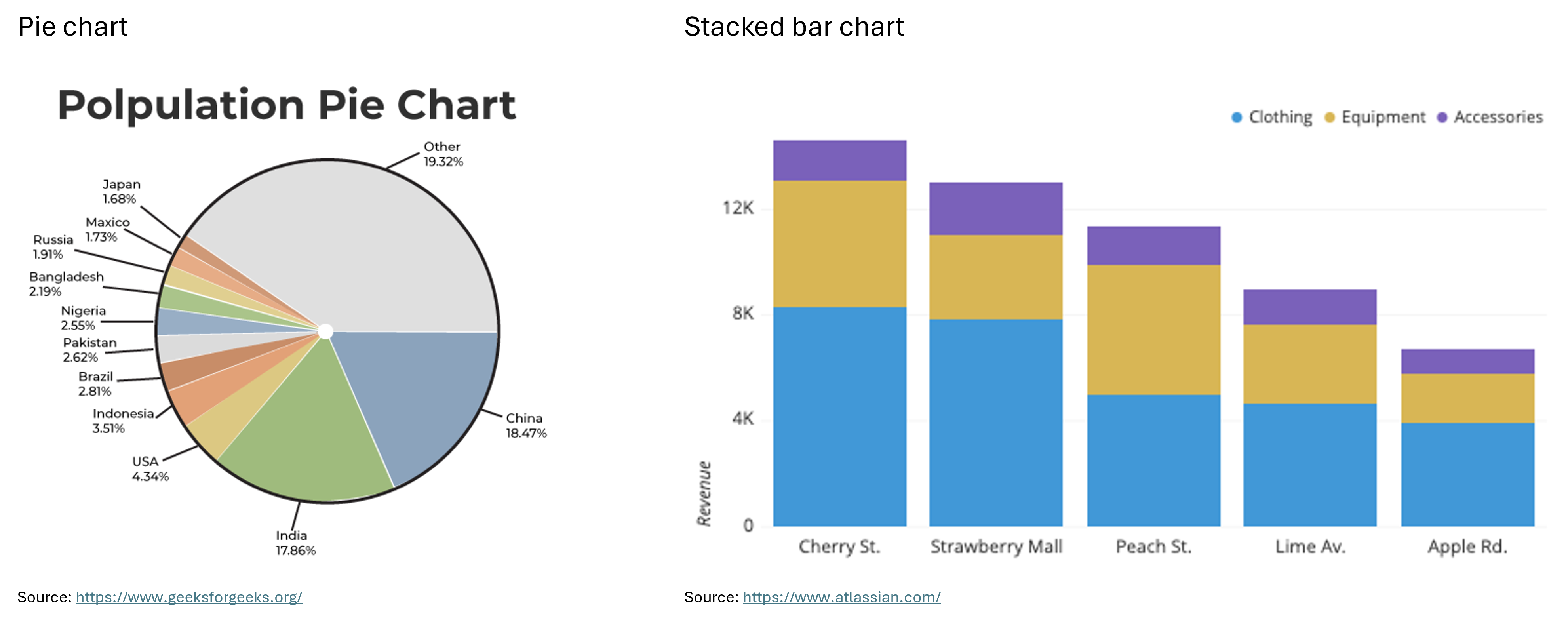
Pie Chart: “A pie chart shows how a total amount is divided between levels of a categorical variable as a circle divided into radial slices. Each categorical value corresponds with a single slice of the circle, and the size of each slice (both in area and arc length) indicates what proportion of the whole each category level takes.” (Atlassian) For example, a pie chart could show the percentage of a company’s budget allocated to different task areas.
Stacked Bar Chart: “A stacked bar chart is a type of bar chart that portrays the compositions and comparisons of several variables through time. Stacked charts usually represent a series of bars or columns stacked on top of one another. They are widely used to effectively portray comparisons of total values across several categories.” (Jaspersoft) For example, the X-axis of a stacked bar chart could represent bins, each covering a 5-year interval, while the Y-axis shows the number of employees at a company in each interval. Each bar can be divided into groups based on experience level, with different colors representing each group.
Below you can see examples of a pie chart and a stacked bar chart.
There are many other types of graphs beyond the ones introduced here, such as area charts, tree maps, funnel charts, violin plots, and more. To explore these charts and graphs further, visit the websites Atlassian or Storytelling with Data.
In the next section, we’ll take a closer look at the correlographic heatmap, the scatter plot, and the bubble chart. We’ll learn how to create them in Python and explore how they can contribute to statistical inference and data storytelling.
- Scatter plots, bubble charts, heatmaps and correlograms for exploring relationships between two or more features.
- Bar charts and line charts for comparing different measures or trends.
- Histograms and box plots for exploring distributions.
- Pie charts and stacked bar charts for drawing comparisons.
Content from Statistical Inference
Last updated on 2026-03-02 | Edit this page
Estimated time: 90 minutes
Overview
Questions
- What does statistical inference mean?
- What other mathematical concepts are needed to understand statistical inference better?
Objectives
- Understand the mathematical concept of statistical inference.
- Understand the difference between descriptive and inferential statistics, correlation and causation.
- Understand the meaning of regression.
There is a lot of text in this episode, which is meant for self study. Make sure to have read the text yourself before the workshop and explain the main concepts to the learners. Put emphasis on the keywords: descriptive and inferential statistics, correlation, regression and causation. Let the learners know that they should keep the information from this episode in mind before moving on to the next one. In the next episode, they are going to learn how to put this knowledge to use for analyzing data and predicting values with data visualization.
This episode demonstrates that data visualization is about more than just storytelling. A common misconception is that humanities researchers and scholars find it difficult to grasp statistical concepts and, therefore, the mathematics behind machine learning and AI. In this episode, you’ll explore the concept of statistical inference, with data visualization serving as a helpful learning tool as you will see in the next episode. This episode will show you how, besides describing your research data, you can also use visualization for predicting missing values and coming up with hypotheses for further research.
Question
Have you ever heard of statistical inference? What does this concept mean in statistics?
Inferential statistics, along with descriptive ststistics, are two major methods of statistical analysis.
- Descriptive statistics summarizes and explains the data we already have, without making generalizations about a larger population.
- In contrast, inferential statistics allows us to draw conclusions about an entire population or predict future trends through hypotheses. These hypotheses are formed based on observations and analysis of a sample from the population. The next step is to test whether the hypothesis is true and applicable to the broader population, or whether our observations were simply due to chance, making the hypothesis false.
Statistical inference according to The online Encyclopedia of Mathematics
“At the heart of statistics lie the ideas of statistical inference. Methods of statistical inference enable the investigator to argue from the particular observations in a sample to the general case. In contrast to logical deductions made from the general case to the specific case, a statistical inference can sometimes be incorrect. Nevertheless, one of the great intellectual advances of the twentieth century is the realization that strong scientific evidence can be developed on the basis of many, highly variable, observations.
The subject of statistical inference extends well beyond statistics’ historical purposes of describing and displaying data. It deals with collecting informative data, interpreting these data, and drawing conclusions. Statistical inference includes all processes of acquiring knowledge that involve fact finding through the collection and examination of data. These processes are as diverse as opinion polls, agricultural field trials, clinical trials of new medicines, and the studying of properties of exotic new materials. As a consequence, statistical inference has permeated all fields of human endeavor in which the evaluation of information must be grounded in data-based evidence.
A few characteristics are common to all studies involving fact finding through the collection and interpretation of data. First, in order to acquire new knowledge, relevant data must be collected. Second, some variability is unavoidable even when observations are made under the same or very similar conditions. The third, which sets the stage for statistical inference, is that access to a complete set of data is either not feasible from a practical standpoint or is physically impossible to obtain.” (Encyclopedia of Mathematics)
When using methods of statistical inference, we work with samples of data because we don’t have access to the entire population. We observe and measure patterns and categories within these samples to form a hypothesis. Proving or rejecting the hypothesis requires mathematical methods that go beyond the scope of this lesson. If you’re interested in learning more about hypothesis testing, you can watch the YouTube video on this topic by DATAtab.
3.1. Correlation and Regression in Inferential Statistics
To perform inferential statistical analysis, it’s important to identify correlations between features in the data. If two numerical features are correlated, an increase or decrease in one tends to coincide with an increase or decrease in the other. For example, if we have data on the lifestyle habits of a group of people and their age at death, we can look for lifestyle factors (such as the frequency of physical exercise or eating habits) that may correlate with longevity and a higher age at death.
If such a correlation is observed and measured, we can use it to predict the lifespan of individuals whose data is not part of the sample. To make this prediction, we first need to establish a mathematical or numerical relationship between lifespan and the other features in the dataset that may correlate with it. In this case, lifespan is considered the dependent variable, as its value depends on the other features. The other features, in turn, are considered independent variables, as their values do not depend on lifespan. This process of numerically relating a dependent variable to independent variables is called regression.
Note
Correlation is not causation! In the example above, even if a correlation is found between lifestyle and lifespan, scientists must seek clinical evidence to determine whether there is also a causal relationship between these two factors. Tyler Vigen, author of the book Spurious Correlations, created a website where he shares humorous correlations between unrelated trends to emphasize this important point: correlation does not imply causation.
However, correlations can still be useful for predicting future trends through regression methods, even if they don’t explain the underlying reasons for these trends.
- The concept of statistical inference.
- The difference between descriptive and inferential statistics.
- The concepts of correlation, regression and causation.
Content from Data Visualization with Python for Statistical Inference and Storytelling
Last updated on 2026-03-02 | Edit this page
Estimated time: 135 minutes
Overview
Questions
- How can you create scatter plots, bubble charts, and correlograms with Python?
- How can these graphs be implemented in data storytelling?
- How can you infer statistical information from a dataset, using these visualizations?
- How can these visualizations contribute to humanists research?
Objectives
- Create scatter plots, bubble charts and correlograms in Python, using the Seaborn library.
- Implement data visualization for exploratory analysis of a concrete dataset and tell a story based on the trends that it reveals.
- Use data visualization to infer information from a concrete dataset.
- Reflect on the use cases of data visualization in humanities research.
This episode is the heart of the present lesson. Manage your teaching time carefully to have enough space for hands-on coding and answering questions in this episode. Make sure that all learners have successfully set up Jupyter Notebook on their computers or have access to Google Colab. Encourage the learners to code along with you. You can stop coding at certain points and elicit the next line of code from the learners. Group work is highly encourages, especially while doing the final exercise.
In the previous episodes, we explored ten types of graphs and their use cases, as well as the concepts of correlation and regression in the context of inferential statistics. Now, it’s time to put this knowledge into practice!
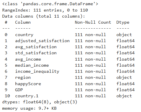
In this episode, we’ll work with the Income and Happiness Correlation dataset from Kaggle (see the Setup episode), which consists of 111 data points. We will explore the dataset through various graphs and use them to craft a narrative around the data. In the final exercise, you will enhance this narrative by inferring information that is not yet present in the dataset.
Note
Before visualizing any dataset, it’s important to answer the following questions:
- What kind of data is stored in the dataset?
- What are the dimensions of the dataset?
- Why do I want to visualize the dataset? What information do I hope to gain through visualization? And which type of graph best represents the information I’m looking for?
Let’s answer these questions for our dataset by writing some code.
4.1. Exploring the Dataset
The dataset we’re working with is stored in a CSV (comma-separated
values) file on GitHub. Let’s load it into our notebook and store it in
a pandas DataFrame named happy_df:
PYTHON
import pandas as pd

# path to the dataset:
url= "https://raw.githubusercontent.com/carpentries-incubator/hermes_stat_inf_data_vis/main/episodes/data/income_happiness_correlation.csv"

# loading the dataset and storing it in a pandas DataFrame:
happy_df= pd.read_csv(url)

# displaying the first five rows of the DataFrame:
happy_df.head()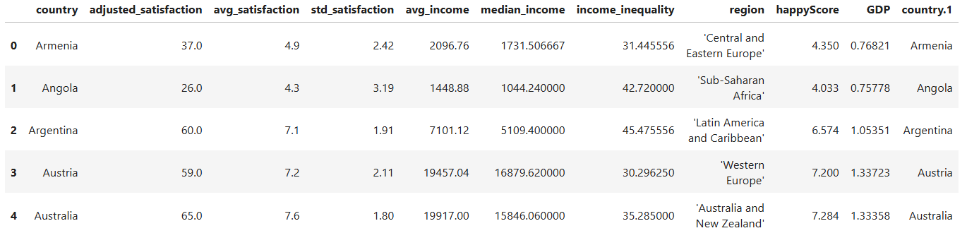
Take a moment to examine the first five rows of the DataFrame. What types of values do you see in each column? Which columns contain numerical values, and which contain categorical values? What information does the dataset include, and what information might be missing?
Run the following line of code to gain more information about the
structure of happy_df:
Question
Which column contains values that could be dependent on other features, and thereby correlates with them? Would it be possible to predict the values of this column, given the values of one or more other columns in the dataset?
Intuitively, one might assume that the happyScore column
contains values that could be predicted based on the other features. So,
it may be possible to estimate the average happiness score of a
country’s population if we know its region, GDP, income inequality, and
average income. In other words, there might be a correlation between
happyScore and the other features.
But how can we determine with greater confidence that such a
correlation exists, and identify which features are more strongly
correlated with happyScore than others? Data visualization
can help us answer these questions.
4.2. Drawing Heatmaps
One of the best and easiest ways to visualize correlations is through
correlographic heatmaps. However, heatmaps can only show how changes in
one numerical value are correlated with changes in another
numerical value. Therefore, to create a heatmap of all
numerical features that could be correlated with
happyScore, we need to exclude the columns in
happy_df that contain non-numerical values:
PYTHON
# selecting only the columns whose values are not of type 'object' and storing them in a new DataFrame:
numerical_df= happy_df.select_dtypes(exclude=['object'])

# displaying the first five rows of the new DataFrame:
numerical_df.head()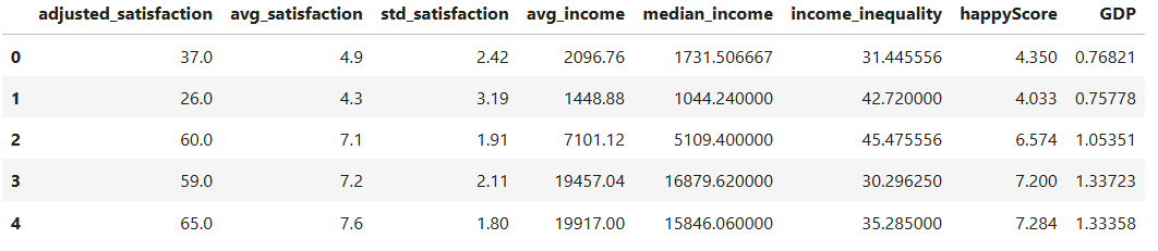
Now, let’s use the Python library Seaborn to create a heatmap of
all the values in numerical_df:
PYTHON
import matplotlib.pyplot as plt
import seaborn as sns

# creating a matrix that contains the correlation of every feature in the DataFrame with every other feature:
corr= numerical_df.corr(method='pearson')

# defining the size of the graph:
plt.figure(figsize=(9, 7))

# generating a heatmap of the corr matrix, using the seaborn library:
sns.heatmap(corr, annot=True, fmt=".2f", cmap='coolwarm', cbar=True)

# giving the graph a title:
plt.title('correlation heatmap')

# diyplaying the graph:
plt.show()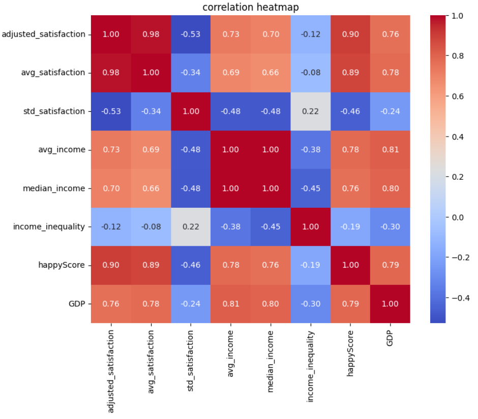
In the code above, we’ve set cmap='coolwarm'. This means
we want the heatmap to distinguish between negative and positive
correlations using red and blue colors. More saturated shades of blue or
red indicate stronger negative or positive correlation values
We’ve set annot=True in our code, which means we want
the correlation coefficients to be displayed on the heatmap. The
correlation coefficients are calculated using the Pearson method in
corr= numerical_df.corr(method='pearson').
“The Pearson correlation measures the strength of the linear relationship between two variables. It has a value between -1 to +1, with a value of -1 meaning a total negative linear correlation, 0 being no correlation, and +1 meaning a total positive correlation.” (ScienceDirect)
How to read and interpret the heatmap:
- Darker red colors, accompanied by values closer to +1, indicate stronger positive correlations. This means that as one value increases at a certain rate, the other increases at a similar rate.
- Darker blue colors, accompanied by values closer to -1, indicate stronger negative correlations. This means that as one value increases at a certain rate, the other decreases at a similar rate.
Question
What patterns does the heatmap above reveal?
- Each feature is most strongly correlated with itself, with a correlation coefficient of +1.
- Values derived from the same feature demonstrate a high correlation.
For example, the correlation coefficient between
avg_satisfactionandadjusted_satisfactionis +0.98, because both stem from the satisfaction degree. The same is true aboutavg_incomeandmedian_incomewith the correlation coefficient being +1.
To create a more precise graph without redundant information, let’s retain only one column from the DataFrame that contains data on satisfaction or income, and remove the others:
PYTHON
# dropping a list of columns from numerical_df and storing the result in a new DataFrame:
reduced_numerical_df= numerical_df.drop(['adjusted_satisfaction', 'std_satisfaction', 'median_income'], axis=1)

reduced_numerical_df.head()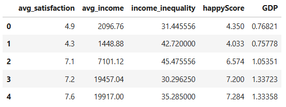
Let’s create the heatmap again, this time using
reduced_numerical_df insted of
numerical_df:
PYTHON
corr= reduced_numerical_df.corr(method='pearson')
plt.figure(figsize=(5.5, 4))
sns.heatmap(corr, annot=True, fmt=".2f", cmap='coolwarm', cbar=True)
plt.title('reduced correlation heatmap')
plt.show()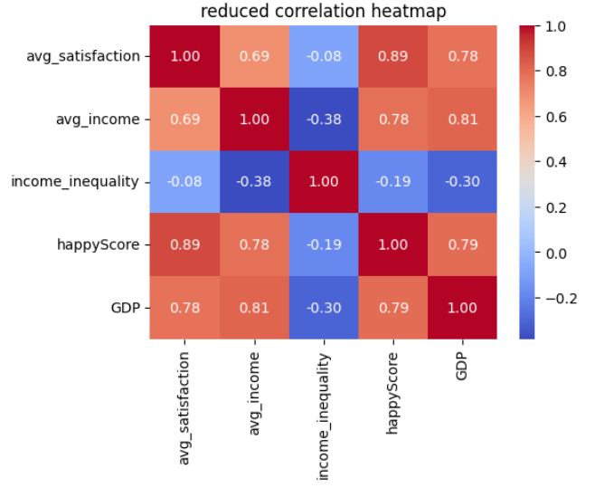
Insight
This heatmap is more meaninful than the previous one and reveals more insights:
-
avg_satisfactionandavg_incomehave a correlation greater that +0.5, indicating that higher income is correlated with greater life satisfaction. - There is a strong positive correlation between
avg_satisfactionandhappyScore. -
avg_satisfactionshows a positive correlation withGDP. - There is a positive correlation between
avg_incomeandhappyScore. - There is a positive correlation between
avg_incomeandGDP. - The slight negative correlation between
avg_incomeandincome_inequalityis also interesting: as the average income in a country increases, income inequality tends to decrease. - There is a negative correlation between
GDPandincome_inequality: higher GDP in a country is associated with lower income inequality.
Let’s now take a closer look at the correlations we’ve observed
between the happyScore and the other features by drawing
different graphs.
4.3. Drawing Scatter Plots
Now that we have a general understanding of the correlations within
the happy_df dataset, let’s take a closer look at these
relationships. We’ll start by visualizing the correlation between
happyScore and another variable with a strong positive
correlation, such as GDP. To achieve this, we can create a
scatter plot:
PYTHON
# defining the size of the graph:
plt.figure(figsize=(8, 4))

# creating a scatte plot, using the seaborn library:
sns.scatterplot(data=happy_df, x='GDP', y='happyScore', zorder=3)

"""
The following block of code enhances the visual appeal of the graph:
"""
# adding grid to the plot:
plt.grid(True, zorder=0, color='lightgray', linestyle='-', linewidth=0.3)

# removing all spines (edges):
sns.despine(left=True, bottom=True)

# setting the background color:
plt.gca().set_facecolor('whitesmoke')
"""
End of customization
"""

# giving the graph a title:
plt.title('correlation between GDP and happyScore')

# diyplaying the graph:
plt.show()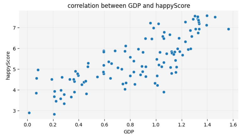
Fun Fact
You are now one step away from understanding how machine learning models predict values. Such a model calculates relationships between features, as shown above, and fits a line to represent them. This involves drawing a line on the scatter plot so that the sum of the squared distances from each point to the line is minimized. This line, as you learned in the previous chapter, is called a regression line. The method used to calculate the line’s position is known as linear regression in statistics. Here is the code to display the regression line on the graph:
PYTHON
plt.figure(figsize=(8, 4))

sns.scatterplot(data=happy_df, x='GDP', y='happyScore', zorder=3)

plt.grid(True, zorder=0, color='lightgray', linestyle='-', linewidth=0.3)
sns.despine(left=True, bottom=True)
plt.gca().set_facecolor('whitesmoke')

# adding a regression line to the graph:
sns.regplot(data=happy_df, x='GDP', y='happyScore', scatter=False, color='red', line_kws={'zorder': 2, 'linewidth': 0.7})

plt.title('GDP vs. happyScore with regression line')
plt.show()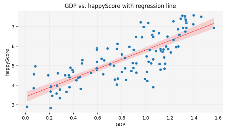
In this lesson, you will not learn the exact formula for calculating the position of the regression line or making precise predictions based on it. However, visualizing the regression line remains a valuable tool in data storytelling. It allows you to make approximate guesses about certain values not present in the dataset by inferring them from the available data. You will have the opportunity to practice this skill at the end of this episode.
The scatter plot reconfirms the insights we gained from the heatmap,
visually demonstrating the positive correlation between GDP
and happyScore: as the value of GDP on the
X-axis increases, the happyScore on the Y-axis also tends
to increase.
What if we also wanted to visualize the region of each country
represented by a dot in the scatter plot? Unlike the heatmap, which
couldn’t display regions due to their categorical nature, the scatter
plot allows us to assign a unique color to each region. This way, we can
see which regions tend to have the highest GDP and
happyScore values:
PYTHON
plt.figure(figsize=(8, 4))

# adding region to the graph as hue:
sns.scatterplot(data=happy_df, x='GDP', y='happyScore', hue='region', palette='Paired', alpha=0.8, zorder=3)

plt.grid(True, zorder=0, color='lightgray', linestyle='-', linewidth=0.3)
sns.despine(left=True, bottom=True)
plt.gca().set_facecolor('whitesmoke')

# adding a legend to the graph:
plt.legend(title='Region', title_fontsize='10', fontsize='9', bbox_to_anchor=(1.05, 1), loc='upper left')

plt.title('correlation between GDP, region and happyScore')
plt.show()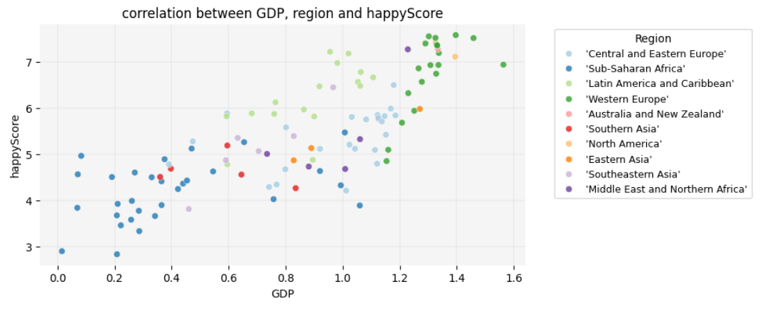
Insight
Interesting! Here are some observable trends in the graph:
- Sub-Saharan African countries have the lowest
GDPs, whereas Western European and North American countries have the highest. However, there are countries in the former region in which thehappyScoreis as high as in some Western European countries, regardless of their very lowGDP. -
GDPis highest in Western European countries. However,happyScorein a considering number of them is similar to Latin American countries and Caribbean, even thoughGDPin these latter regions is lower. - The variation in happiness levels within the same region is greatest
among Western European countries, although they all fall into the
highest
GDPcategory.
Take a closer look at the graph and see if you can identify any additional trends.
4.4. Drawing Bubble Charts
Let’s add one more variable to the graph to explore how
avg_income is distributed across different regions and how
it correlates with region, GDP and
happyScore. We’ll add avg_income as the node
size in the scatter plot, creating a bubble chart:
PYTHON
plt.figure(figsize=(8, 5))

# adding avg_income to the graph as node size:
sns.scatterplot(data=happy_df, x='GDP', y='happyScore', hue='region', size='avg_income', sizes=(20,500), palette='Paired', alpha=0.6, zorder=3)

plt.grid(True, zorder=0, color='lightgray', linestyle='-', linewidth=0.3)
sns.despine(left=True, bottom=True)
plt.gca().set_facecolor('whitesmoke')
plt.legend(fontsize='9', bbox_to_anchor=(1.05, 1), loc='upper left')

plt.title('correlation between GDP, region, avg_income and happyScore')
plt.show()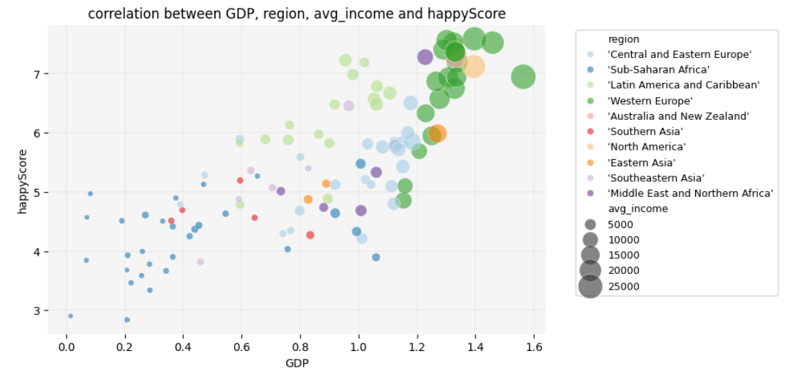
Insight
Here, another interesting trend emerges: average income only begins to increase significantly once GDP exceeds a value of 1.
What additional insights can you derive from this graph? Consider
exploring patterns such as which regions have high
happyScore values relative to avg_income. You
might also observe whether certain regions exhibit consistent patterns
between avg_income and happyScore despite
differences in GDP.
4.5. Diving Deeper into Details
As a final step in our exploration, let’s focus on the countries in
Sub-Saharan Africa to identify which ones have a low GDP
but a high happyScore:
PYTHON
# selecting only the countries that belong to the Sub-Saharan Africa and storing them in a new DataFrame:
african_df= happy_df[happy_df['region']=="'Sub-Saharan Africa'"]

african_df.head()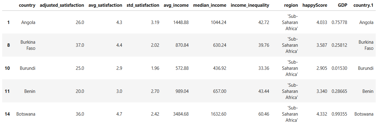
PYTHON
plt.figure(figsize=(10, 7))

sns.scatterplot(data=african_df, x='GDP', y='happyScore', size='avg_income', sizes=(20, 200), alpha=0.6, zorder=3)

plt.grid(True, zorder=0, color='lightgray', linestyle='-', linewidth=0.3)
sns.despine(left=True, bottom=True)
plt.gca().set_facecolor('whitesmoke')

# adding country names to the nodes:
for i in range(len(african_df)):
    plt.text(
        african_df['GDP'].iloc[i],
        african_df['happyScore'].iloc[i]+0.03,
        african_df['country'].iloc[i],
        fontsize=7,
        ha='center',
        va='bottom'
    )

plt.legend(fontsize='9', bbox_to_anchor=(1.05, 1), loc='upper left')
plt.title('correlation between GDP, avg_income and happyScore in Sub-Saharan Africa')
plt.show()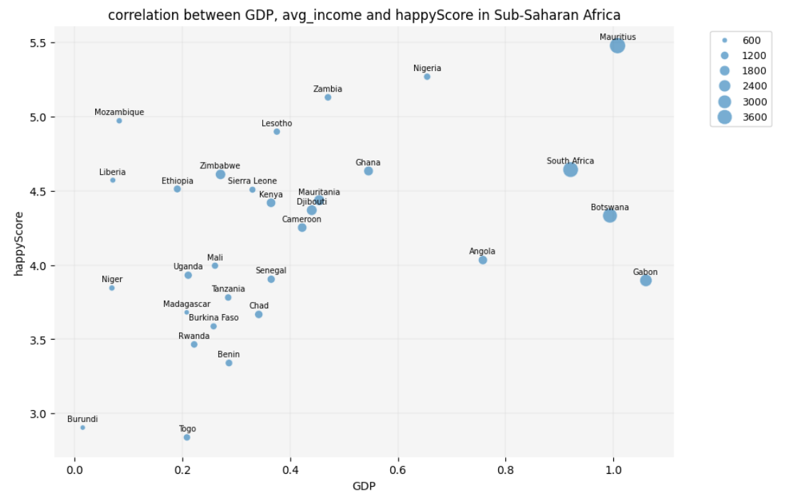
Question
The scatter plot reveals that some economically poor countries in
Sub-Saharan Africa, such as Mozambique and Liberia, have a low
GDP and avg_income but still demonstrate a
high happyScore. But didn’t the heatmap that we created
earlier show a positive correlation between happiness and GDP? Isn’t
this a contradiction?!
Yes and no! Remember, we excluded categorical data, such as region
and country names, from happy_df to create the heatmap. By
analyzing only numerical values, we observed a generally positive
correlation between GDP and happyScore.
However, the scatter plots and bubble chart suggest that maybe cultural
factors specific to each country are significantly correlated with
happiness. This impact is especially visible among Sub-Saharan African
countries.
Therefore, if we want to draw an inferential conclusion from our
observations, it would be this: happiness appears to be influenced by a
combination of GDP, income, and cultural factors. To predict a country’s
happyScore based on our findings, we would need to know its
region (which reflects GDP and cultural context) and possibly the
country’s average income level.
4.6. Exercise
Take two countries that are not listed in the DataFrame, for example
Iran and Turkey. Given the correlations that we have so far detected in
the dataset, try to predict how high their happyScore is.
To do so, you need the following information:
- Which region do these countries belong to? Which countries in
happy_dfare culturally more similar to Iran and Turkey? - How high are
GDPandavg_incomein these countries?
look at the scatter plot with a regression line and the bubble chart
and try to predict where the happy_scores of these two
countries, Iran and Turkey, would be placed on the chart.
- Draw scatter plots, bubble charts and correlograms in Python, using the Seaborn library.
- Implement data visualization for exploratory analysis of a concrete dataset and telling a story based on the trends that it reveals.
- Use data visualization to infer information from a concrete dataset.
Content from Conclusion
Last updated on 2025-01-23 | Edit this page
Estimated time: 10 minutes
Overview
Questions
- How can I apply what I have learned in this lesson?
- In which areas can I further expand my knowledge based on what I have learned?
Objectives
- Review the possibilities of data visualization for statistical inference and storytelling in humanities research.
- Embark on new educational journeys based on the content learned.
This lesson demonstrated how data visualization can teach the mathematical concepts behind machine learning and how it can be used not only to describe data but also to make preliminary predictions. While predictions based on visualization aren’t as precise as those derived through mathematical modeling, they can still support effective data storytelling.
In this lesson, you explored the concepts of statistical inference
and regression through data visualization — two foundational processes
in machine learning models. While we didn’t delve deeply into the
mathematical details of these concepts, you learned their underlying
logic and applied it by predicting the happyScore for two
countries not included in the dataset. Additionally, you gained
experience in visualizing scatter plots, bubble charts, and heatmaps
using Python’s Seaborn library.
Understanding the difference between inferential and descriptive statistics, as introduced in this lesson, not only clarifies how machine learning models predict values but also strengthens your data storytelling skills. If you’ve primarily focused on describing existing data in your storytelling, you can now make approximate predictions for values not yet in your dataset based on the available data.
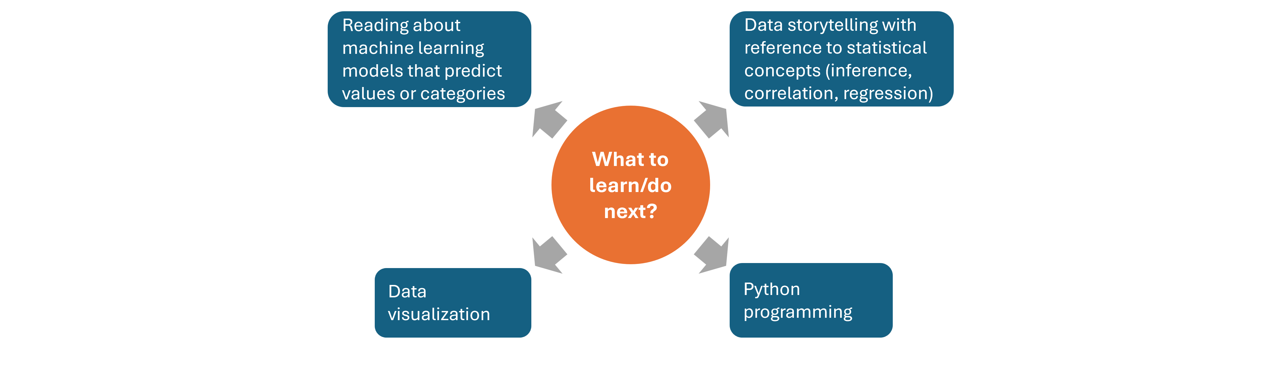
What’s next?
Your next step could involve diving into the mathematical foundations of inferential statistics, including probability distributions, sampling methods, and the central limit theorem, to deepen your understanding of predictive models. You might also explore fundamental machine learning concepts, such as training and testing datasets and algorithms like linear regression and decision trees. Enhancing your Python data visualization skills and refining your approach to data storytelling by combining description and prediction could also be valuable next steps.
- Explore the possibilities of data visualization for statistical inference and storytelling.
- Figure out the next learning steps.